Web Logos That Work Everywhere: A File-Ready Export Checklist (No Guessing)
Rowan Ellis | Updated June 7, 2026
A web logo rarely fails because the design is bad. It usually fails because one file is being asked to do five jobs it was never prepared for.
For broader planning context, teams can compare guidance from web.dev guidance before choosing a workflow.
Most readers arrive with the same practical questions. Which logo files do I actually need? When should I use a transparent background? How small can the logo get before it stops reading clearly? And how do I avoid the usual mix of blurry exports, dark-background surprises, and files named final-final-v2.png?
The useful takeaway is straightforward: one approved export set does more for consistency than repeated last-minute fixes. If your logo appears in a website header, in a small navigation slot, near buttons, and inside email graphics, it needs a small group of files that were prepared for those placements on purpose.
This guide turns that handoff into a checklist. We will cover the minimum export set, background strategy, realistic sizing, small-size tests, contrast checks, file naming, compression, and accessibility notes. If you want broader context for the rest of the site, the homepage, services page, and blog show where those files usually have to perform.
Related implementation details are also covered in MDN Web Docs, which helps keep tool decisions grounded in established practices.
Why “one logo file” usually fails on the web
A single file can look fine in one place and weak everywhere else. That is not a contradiction. It is just a reminder that websites use the same mark under different conditions: large header, small mobile header, dark footer, light content area, email banner, social thumbnail, and the occasional button-adjacent placement where space is tight.
Consider a common example. A designer exports one large JPG because it looked good on a white artboard. The desktop header seems acceptable. Then the mobile header reduces it until the type goes soft, the dark section reveals a pale box around the logo, and the email graphic crops the mark because the transparent padding is too generous. Nothing dramatic happened. The file simply was not prepared for those uses.
Another common case is the “master PNG” that is far larger than any real display size. It gets shrunk by CSS and still looks a little soft because the browser is doing cleanup work the asset should have handled in advance. The logo is not broken, but it never looks settled either. That feeling of almost-right is expensive because it spreads everywhere.
If you have already been reviewing logo behavior on live pages, the earlier guide on choosing PNG, JPG, and SVG for web logos is a useful companion. This article picks up one step later: what your ready-to-use export folder should contain.
Terminology that keeps the checklist clear
Before getting into formats and sizes, it helps to define four terms in plain language.
| Term | What it means in practice | Why it matters |
|---|---|---|
| Vector | Artwork built from shapes and paths, usually delivered as SVG for web use. | It stays sharp at many sizes when the logo artwork is suitable for vector export. |
| Raster | Artwork made from pixels, such as PNG or JPG. | It needs to be exported at sensible dimensions so it does not blur when scaled. |
| Transparent background | No white rectangle behind the logo. | This is what allows the mark to sit cleanly on light, dark, or textured page sections. |
| Lockup | A specific arrangement of the logo symbol, wordmark, and any tagline. | You often need a primary lockup and a simplified small-space lockup instead of forcing one version into every slot. |
That vocabulary matters because the problem is not “which extension is best” in the abstract. The real question is which version of the mark fits the placement you are preparing.
Minimum export set: the files most sites actually need
You do not need a folder full of mystery variants. Most sites are well served by a short, explicit set.
1. Primary vector file
Use an SVG when the logo is clean vector artwork. This is usually the best starting point for website headers because the mark stays crisp across different screen densities.
2. Transparent PNG fallback
Keep one transparent raster export for systems or workflows that do not handle SVG comfortably, especially in email graphics or older content blocks.
3. Dark-background version
If your site uses dark headers, dark footers, or photo backgrounds, prepare a reversed or light-color version now instead of improvising later.
4. Small-size exports
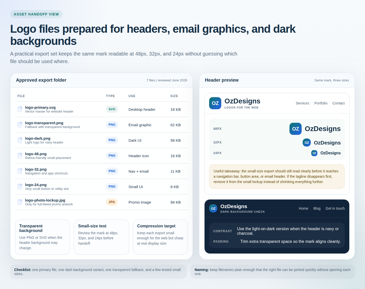
Keep approved small PNG sizes such as 48px, 32px, and 24px for situations where the logo behaves more like a compact UI element than a hero asset.
An optimized JPG only belongs in the set if you are dealing with a photographic or heavily textured brand image rather than a normal logo mark. For most wordmarks and symbols, JPG is the least useful option because it removes transparency and introduces compression artifacts around hard edges.
The minimum set is intentionally small because a smaller handoff is easier to use correctly. When teams misuse logo files, it is often because nobody can tell which file is the approved one.
Background strategy: when transparency is doing the heavy lifting
Transparent files solve more problems than people expect. If the logo might sit on white, off-white, navy, charcoal, or a photographic hero section, a transparent background keeps the edge of the mark from announcing itself at the wrong moment.
Use a transparent SVG or PNG when the page background may vary. This covers most website headers, many content sections, and most email graphics. Use a solid-background version only when the logo is intentionally placed inside a fixed badge, banner, or promo block that always uses the same fill color.
Here is a practical rule of thumb:
- Transparent background: default choice for website headers, navigation, inline content areas, and email graphics.
- Solid background: useful when the logo is part of a locked promo tile, sponsored image, or campaign graphic with one fixed canvas color.
- Separate dark-background version: necessary when the original colors disappear against darker UI sections.
A quick example makes the decision easier. If a white wordmark sits on a navy header, use the approved light-on-dark version. Do not place a normal dark logo on top and hope the surrounding drop shadow will save it. Contrast should come from the file choice, not from a rescue effect added afterward.
Sizing rules of thumb for headers, navigation, and buttons
There is no magic universal number, but there are sane ranges that keep you out of trouble.
| Placement | Typical display size | Useful export advice |
|---|---|---|
| Desktop header wordmark | 160 to 260 px wide | Use SVG first, or a PNG at real display width plus a 2x fallback. |
| Mobile header | 120 to 180 px wide | Simplify the lockup if the full version feels cramped. |
| Navigation icon or compact mark | 24 to 48 px | Prepare dedicated small exports instead of shrinking a large file on the fly. |
| Email header graphic | 200 to 320 px wide | Use a transparent PNG if the email tool is happier with raster files. |
| Button-adjacent or utility placement | 24 to 32 px | Keep details minimal and trim empty space around the mark. |
The important part is not the exact number. It is matching the export to the real slot. If the live header only ever displays the logo at 180 pixels wide, a giant raster export is not helping you. It is just creating extra file weight and leaving the browser to do the resizing.
That same logic matters on the Email Application Form or any page where a smaller interface element has to sit near buttons, labels, and other UI text. A slightly oversized logo can make the whole section feel crowded.
Readable at small sizes: test at 24px, 32px, and 48px
Small-size testing is where vague confidence stops being useful. You need to look at the logo in the sizes where it is most likely to fail.
- Start at 48px. This catches logos that are generally solid but lose a little internal space or line clarity when reduced.
- Check 32px next. At this size, thin strokes, long taglines, and fine serifs usually reveal themselves as the weak points.
- Finish at 24px. If the full lockup still works here, excellent. If not, that is the sign to switch to a simplified mark, not to keep shrinking and hoping.
Two examples tend to repeat across projects:
- Example 1: the main wordmark is clear at 48px and 32px, but the tagline disappears. The fix is a small-size lockup without the tagline.
- Example 2: a symbol with narrow internal gaps fills in at 24px. The fix is to simplify that small icon version or increase negative space in the tiny export.
Do the test inside a real browser window when possible. A design app preview is helpful, but the live browser is where spacing, adjacent navigation, and actual background color all show up together.
Contrast check: light backgrounds, dark UI, and the places logos disappear
A logo can be technically sharp and still fail because the contrast is wrong. This usually shows up when the mark moves from a white artboard to a dark header, muted hero image, or low-contrast footer.
Light background check
Make sure pale parts of the logo do not disappear into white or off-white sections. A warm cream header can be enough to weaken a logo that looked fine on pure white.
Dark background check
Use the approved reversed or light version instead of forcing a dark logo onto navy, charcoal, or photographic sections.
UI context check
View the logo next to navigation links, buttons, and form elements. If the logo competes with nearby controls, adjust size or spacing before launch.
A useful test is simple: place the mark on one light background, one dark background, and one mid-tone or photographic section. If one version fails, that is evidence you need an alternate export, not that the page somehow deserves blame.
Naming and versioning: the least glamorous part that saves real time
File naming is not decorative work, but it keeps teams from using the wrong asset under deadline pressure.
A clean pattern is enough:
brand-logo-primary.svgbrand-logo-transparent.pngbrand-logo-dark.pngbrand-logo-48.pngbrand-logo-32.pngbrand-logo-24.png
Then add one simple rule for versions. Keep the live set in one folder and move replaced files into an archive folder instead of leaving old and new exports mixed together. That prevents the quiet disaster where someone uploads last month’s file because it happened to sort first.
If the logo handoff is part of a larger website build, include a short usage note beside the files. One sentence per file is enough: “primary SVG for header,” “transparent PNG for email,” “dark version for navy background,” and so on. Readers browsing the services and contact pages should see the same brand behavior, not a rotating cast of almost-matching uploads.
Compression without quality loss: what to watch instead of chasing a magic number
The right compression target depends on the artwork, so the safer rule is to compare clarity against real display size rather than memorizing a single file-size number.
In practice, the checklist is short:
- Start with the smallest useful dimensions. Do not export a huge raster file and expect compression alone to make it efficient.
- Compare SVG and PNG if both are available. For simple logos, SVG is often lighter and sharper. For more complex artwork, the PNG may still be reasonable.
- Avoid JPG for ordinary logos. It usually saves weight by sacrificing the exact edge quality logos rely on.
- Check the file after export. Compression that introduces halos, ringing, or muddy edges is not a good trade.
A useful working standard is this: if the asset looks clean at the exact size the page uses and does not feel unnecessarily heavy, it is likely good enough. Perfection is not the goal. Predictable rendering is.
Alt text and usage notes: the final handoff most teams skip
Logos need accessibility notes too. Alt text should describe the logo as a logo, not narrate every visual flourish. “OzDesigns logo” is often enough when the image is purely brand identification. If the logo includes meaningful text that is not repeated nearby, include that text in the alt description.
Usage notes are equally practical. Keep a short list with the exported files:
- Where to use each file: header, dark background, email graphic, or compact UI.
- Minimum size: note when the full lockup stops being readable and the simplified version should take over.
- Background limits: specify whether the file is intended for light, dark, or variable backgrounds.
- Spacing note: mention if extra transparent padding has already been trimmed so the file aligns correctly.
That guidance prevents someone from picking the wrong file and then trying to solve the mistake with CSS, filters, or manual cropping. The cleaner fix is almost always choosing the right export first.
Practical conclusion: the export checklist to keep
- Keep one primary vector file when possible.
- Keep one transparent PNG fallback for web and email use.
- Prepare a dark-background version if the logo ever sits on dark UI.
- Test readable small sizes at 48px, 32px, and 24px.
- Trim unnecessary transparent padding.
- Name files plainly enough that the right export is obvious.
- Check compression against real display size, not guesses.
- Add short alt text and usage notes before handoff.
If you are comparing broader website production workflows while you tighten up brand assets, this article on how AI web builders compare with traditional website templates is a useful side read. For help applying the checklist to your own pages, review the current site structure through the blog, then use the contact page if you want a second set of eyes on a logo or header handoff.