Logos & Web Buttons: A Quick Guide to “Spammy” vs “Professional” Email Signup Copy
If a signup button sounds even slightly slippery, people feel it before they can explain it. That is the awkward little truth behind email signup copy: the words around your form do a lot of the trust-building before the form itself ever gets a chance.
I keep coming back to the same questions when I read a signup form: What am I actually signing up for? How often will you email me? Can I leave later without a mess? If your copy answers those questions fast, the form feels calm. If it doesn’t, even a pretty button can start to feel like a trap in a nice sweater.
This matters because the language around your form does not just shape clicks. It shapes expectations, complaint risk, and whether people feel confident enough to finish the last step. The FTC’s CAN-SPAM compliance guide is a useful reminder that unsubscribe clarity and truthful messaging are not optional niceties. And the W3C’s guidance on labels and instructions shows why clear form text helps people complete forms without guessing.
In this guide, I’m going to show you how to rewrite signup copy so it sounds professional instead of spammy, where microcopy earns its keep, which trust signals are safe to include, and what to check before you publish. If you want to compare your form against a real page, open the Email Application Form page, then come back here with a sharper eye.
Why signup copy changes trust before it changes conversion
People often think conversion happens at the button. In practice, the button is only the last visible mile. The real decision is made by the small details that surround it: the headline, the required field labels, the privacy line, the helper text, and the wording on the confirmation state. That is where the form either feels safe or starts to feel pushy.
There is also a plain usability reason to care. If someone has to stop and decode your form, the friction shows up as hesitation, abandonment, or low-quality signups. Nielsen Norman Group has written extensively about microcopy and why tiny bits of text can carry a lot of meaning. In a signup form, those tiny bits are often the whole story.
Here is the quick version of the relationship between copy and trust:
- Clear copy reduces uncertainty.
- Reduced uncertainty reduces bounce and second-guessing.
- Lower friction usually means better-quality signups, not just more signups.
- Better expectations mean fewer complaints later when the first email arrives.
That last point matters a lot. A signup form is a promise machine. If the promise is vague, people fill in the blanks themselves, and they usually do it with a little suspicion. A professional form does not need to over-explain; it needs to be direct enough that the reader can relax.
The “free, not spam” promise: what to say and what to avoid
There is a right way and a wrong way to say “this is free and you will not be spammed.” The wrong way is loud, dramatic, or oddly defensive. The right way is calm, specific, and short. The point is not to sound clever. The point is to sound believable.
| Spammy-sounding copy | Professional copy | Why it works better |
|---|---|---|
| FREE!!! JOIN NOW!!! | Free email application. No charge. | It states the benefit without shouting at the reader. |
| We absolutely promise you will never get spam. | We only use your details to process this request. | It avoids an absolute claim and explains the purpose. |
| Hurry, limited-time no-risk offer!!! | Submit the form when you are ready. | It lowers pressure and sounds more honest. |
| No tricks, no scams, no nonsense | Clear fields, clear reply, clear next step. | It describes the experience instead of overdefending it. |
If you want a simple rule, use this: **tell the reader what happens, not what you hope they infer**. For example, “Free of charge. You can unsubscribe at any time.” is better than “100% safe and guaranteed spam-proof.” The first sentence is clear. The second sentence is trying a little too hard, and people can smell that from across the room.
One more useful distinction: a trust line should be informational, not theatrical. “We will never share your email” can be true and helpful, but it still works best when you explain what sharing means in context. “We use your email only for this request and reply” is usually more concrete than a bigger-sounding promise.
If you also need a practical example of the broader form experience, the Services page is a good place to think about the kind of help a visitor expects after they click. The tone of the form should match that expectation.
Microcopy that works: buttons, required fields, and privacy reassurance
Microcopy is the small text that helps someone get through a task. It is not the headline and it is not the page essay. It is the little trail of breadcrumbs that says, “Yes, this is the right path.” In a signup form, that includes button labels, field hints, error messages, and the line under the form that explains what will happen next.
W3C’s form guidance on instructions is useful here because it reinforces a simple idea: the instruction should live where the user needs it, not in a separate paragraph they will forget while tabbing down the page. If a field is required, say so. If a field accepts a short note, say so. If there is a size limit or a format expectation, say that too.
Good button labels are specific and calm
A button label should tell the user what kind of action they are taking. “Submit” is legal in the same way a stone is a doorstop: technically true, not especially welcoming. A better label makes the action feel human and predictable.
- Send application – clear and direct.
- Request access – useful when access is the outcome.
- Join the list – friendly when the intent is opt-in communication.
- Get updates – works when the value is ongoing information.
- Start my request – softens the action without being vague.
- Preview and send – good when you want to reduce mistakes.
Required fields should not make people play detective
There is a special kind of frustration that comes from a form where the required fields are hidden in plain sight. The user is not angry because the form is complicated. They are annoyed because the form acted like a riddle for no reason. That is why the label itself should do the work, not the color alone.
Helpful field helpers might sound like this:
- “Required” after the label, not hidden in a legend.
- “Use the email you check most often.”
- “A short sentence is fine.”
- “We only use this to reply to your request.”
- “Choose the option closest to your request.”
- “No attachments needed.”
- “You can add details if you want.”
- “We will never post this publicly.”
Notice what these lines do not do. They do not promise miracles. They do not lecture. They do not fill the page with legal fog. They simply make the next move obvious. That is the whole job.
Privacy reassurance should be short, not dramatic
A privacy line works best when it is short enough to read without sighing. “We use your email only to respond to this form” is better than a paragraph that tries to sound like a privacy policy written by a nervous robot. If your site has a dedicated Privacy Policy, link to it nearby, but do not bury the reassurance in the legal page and expect the visitor to go spelunking for comfort.
If the form sits near the footer or in a service page layout, a small line like “You can unsubscribe any time” can be enough. The W3C’s labels tutorial and the FTC’s CAN-SPAM guide both point in the same direction here: **clarity wins because it reduces guesswork**.
What PoP3 means in plain English
People still see the term PoP3 on old email pages, settings screens, and service descriptions, so it helps to define it without turning the article into a protocol lecture. In plain English, PoP3 is a way for email to be picked up from one place and delivered to another place where the user can read it. It is a mail-handling method, not a magic trust seal.
Why mention it in an article about signup copy? Because readers sometimes confuse the mechanics of email delivery with the wording around the form. They are related, but they are not the same thing. A good signup form copy does not need to explain every server detail. It only needs to reassure the user about what happens after submission and where the message goes.
Here is the simplest way I would explain it to a non-technical reader:
- PoP3 is one of the older ways email can be received.
- It helps move messages from a server to the place where the user reads them.
- For a signup form, the important part is not the acronym itself, but the promise that the message will be handled correctly.
- If the form needs a specific email address, say so in plain language.
That is enough. If you start going deeper than that in signup copy, you usually lose the reader before you gain any trust. Keep the technical details available in help content if needed, but let the form itself stay readable.
Trust signals that are safe to include
Trust signals are the little proof points that tell the visitor the form is operated by a real, reachable business. You do not need a giant badge wall. In fact, too many badges can make a page look a little desperate, like it is trying to convince you it is trustworthy by shouting the word “trust” in six different fonts.
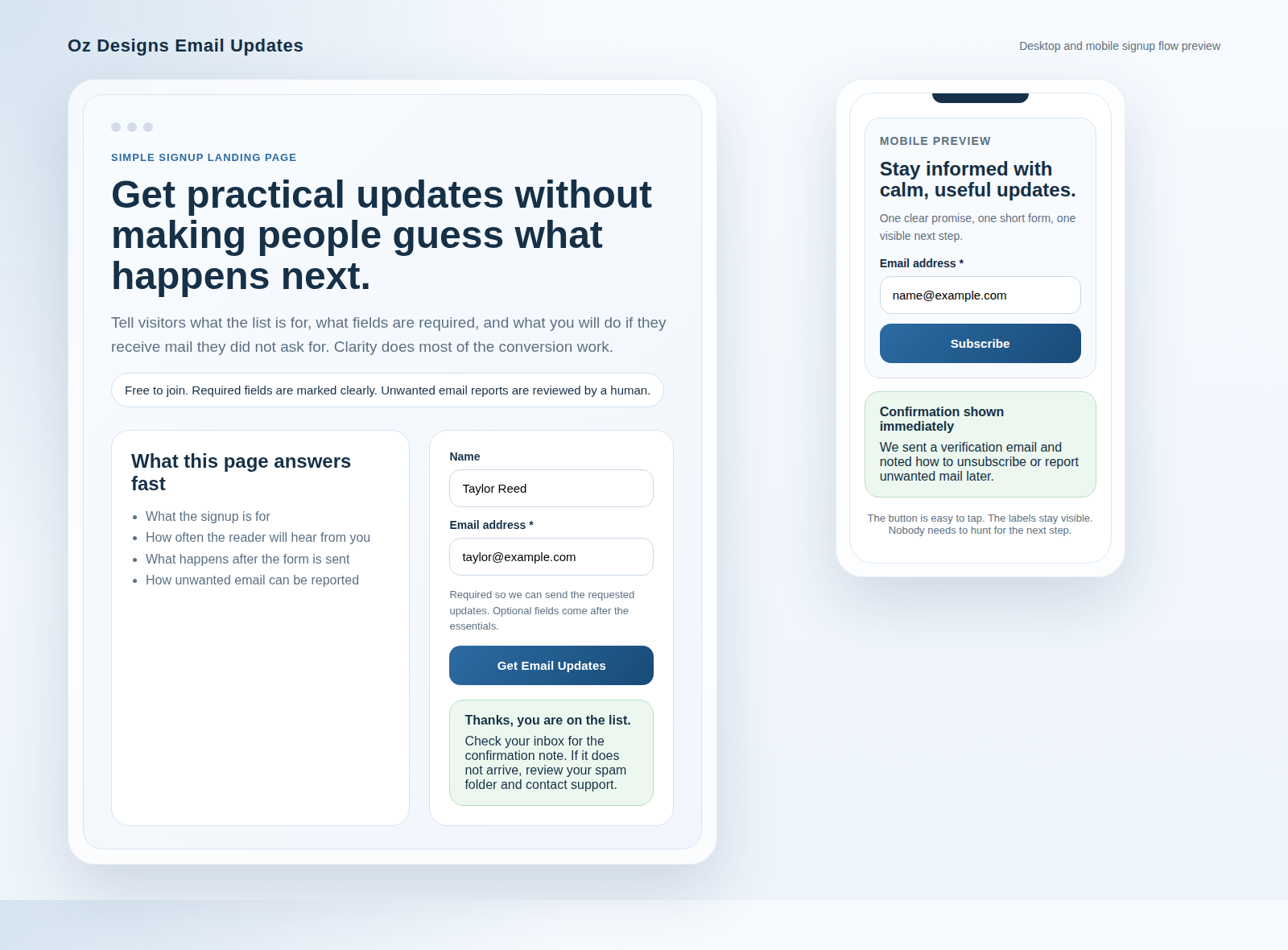
Safe trust signals usually include four things:
- A visible contact path if the visitor has a question.
- A clear sentence about what happens after submission.
- An unsubscribe or stop-receiving note if the form leads to ongoing emails.
- A realistic timeline for the reply, such as “We will respond within two business days.”
The important word there is realistic. Do not promise instant support if the workflow cannot deliver it. Do not promise the email will never be shared unless you truly mean that and can stand behind it. Do not turn a simple signup into a magical security claim. A professional form sounds trustworthy because it is precise, not because it is dramatic.
Another safe trust signal is a simple confirmation statement. For example: “Thanks, your request is in. You will receive a confirmation email shortly.” That is useful because it tells the user the form worked and what to expect next. It does not overstate protection, and it does not pretend to solve every possible complaint scenario before they exist.
If you are building this as part of a broader site flow, the home page should make the same promise in a more general way, and the blog should keep reinforcing the idea that the site is here to help, not to trick anyone into a mailing list they never wanted.
Common mistakes that make signup forms feel spammy
Most bad signup copy is not bad because the writer is careless. It is bad because the writer is trying to do three jobs at once: market the offer, reassure the visitor, and cover every possible edge case. The result is usually a line that feels inflated and oddly defensive.
1. Vague promises
“We respect your privacy” sounds fine, but it does not tell the reader what happens to the email address. “We use your email only to respond to this request” is better because it gives the promise a job.
2. Scary language
When a form says things like “Do not miss out” or “Final warning,” the trust tone drops fast. That language may create urgency, but it also suggests that the form is trying to pressure the user instead of inform them. If you want the reader to take the next step, pressure is a poor substitute for clarity.
3. Missing instructions
A required field that does not say it is required is not a clever puzzle. It is just a bad field. The same goes for note boxes, phone fields, and dropdowns. If the user has to guess the format, they will guess wrong often enough to hurt the experience.
4. Too much legal language in the form itself
There is a place for policy pages, but the form is not that place. The form should contain the practical summary, not the full legal essay. If you need the policy content, link it nearby in a readable way and keep the field copy short.
5. Button labels that hide the outcome
“Continue” or “Next” can be fine in a multi-step flow, but on a single form they often feel coy. The user should know what they are about to send. “Send application” or “Request info” is clearer than “Continue,” which can feel like the site is politely dodging the point.
For related setup advice, your contact page and service pages should carry the same tone. A site that sounds calm on one page and shouty on the next makes visitors do extra emotional math, and nobody clicked a form to do emotional math.
A mini swipe file: 6 button labels and 8 field helpers
If you just need something practical to copy and adapt, start here. This is not a treasure chest of genius. It is a list of sturdy, sensible lines that feel professional without sounding stiff.
| Button label | Best use | Tone |
|---|---|---|
| Send application | General request forms | Direct, calm |
| Get updates | Ongoing email signups | Friendly, low pressure |
| Request information | Quote or service inquiries | Clear, formal |
| Join the list | Newsletter-style forms | Simple, approachable |
| Preview and send | Forms where errors matter | Careful, reassuring |
| Start my request | Low-friction onboarding | Inviting, not pushy |
Now for the helper lines. These are small, but they do a lot of the heavy lifting when the reader is deciding whether the form is worth the time.
| Helper line | Where to use it | What it accomplishes |
|---|---|---|
| Required | Next to labels | Removes guesswork |
| Use the email you check most often | Email field hint | Improves reply delivery |
| We only use this to reply to your request | Privacy line | Explains the purpose |
| A short note is fine | Message field helper | Reduces pressure |
| No attachments needed | Message field helper | Saves time and confusion |
| You can add more details if you want | Optional field note | Encourages helpful detail without forcing it |
| We will send a confirmation after submission | Below the button | Sets expectations |
| You can stop receiving messages any time | Signup or footer note | Reassures the reader about control |
If you need a place to route the user after they decide to act, the Services page can give a better sense of the next step. If the next step is unclear, the button copy has to do too much work. That is usually where copy starts to sound spammy by accident.
Checklist: before you publish your signup form, confirm these 10 items
Here is the practical test I would run before I let a signup form go live. It is short enough to use and specific enough to catch the common mistakes.
- Does the form say exactly what the visitor is signing up for?
- Does the button label describe the action clearly?
- Are required fields marked in a way people can see instantly?
- Do the helper lines explain format or intent without extra fluff?
- Is the privacy reassurance short, clear, and believable?
- Does the form explain what happens after submission?
- Is there a reachable contact path if the visitor has a question?
- Does the copy avoid absolute claims you cannot truly guarantee?
- Does the success message confirm that the request went through?
- Would this page still sound professional if you removed the design and left only the words?
That last one is my favorite test because it is brutally honest. A form can look polished and still read like it was written in a hurry by someone trying to outrun uncertainty. If the words hold up on their own, the design usually has a much easier job.
If you want to see how these pieces come together in a real visitor flow, compare this guide with the Email Application Form and then look at the broader site navigation. The goal is not to make the visitor admire the microcopy. The goal is to make them stop worrying about it.
Conclusion
Professional signup copy is not about sounding fancy. It is about sounding like someone who understands what the visitor is trying to do and what they are nervous about. The best forms are usually the least theatrical ones. They explain the action, set the expectations, and leave the reader with the sense that the site will behave like a normal, responsible place.
If I had to compress the whole guide into one sentence, it would be this: **write the form like a helpful human, not like a campaign trying to win a shouting contest**. That means clear buttons, short helper text, believable trust lines, and a path to contact if something goes sideways.
For a quick recap:
- Trust comes from clarity, not hype.
- Microcopy carries more weight than most people expect.
- Safe trust signals are simple and specific.
- Good forms make the next step obvious.
- A 10-item checklist catches most of the common mistakes before they reach the public.
If you are refining your own site, the next sensible place to look is the form itself, the surrounding service page, and the contact path. That is where the words either make the experience feel tidy or make it feel like a tiny maze. I prefer tidy.