Free Email Application Forms That Don’t Attract Spam: A Field-by-Field Guide
Email form guide
Free Email Application Forms That Don’t Attract Spam: A Field-by-Field Guide
A good email form does two jobs at once: it lets real people in quickly and it gives junk submissions fewer places to hide. The trick is not magic. It is plain language, fewer fields, and a setup that does not confuse the visitor for sport.
The reader usually arrives with the same questions: Which fields are actually necessary? What does “required” mean without the usual fog machine? How do you reassure people that the service is free and they will not be buried in spam? Those are form questions, but they are also trust questions. Pretend otherwise and the form will punish you for it.
There is already enough guidance to keep this simple. MDN documents the built-in email input type, and the W3C’s label guidance for forms says the obvious thing that still gets ignored: people need clear labels, not detective work. If a label, a field, or a promise can be misread, it eventually will be.
This guide walks field by field through a sane signup form: what belongs, what should stay optional, how to label the email field, where to place trust copy, what to say about unwanted messages, and how to check the form before you let the public poke at it.
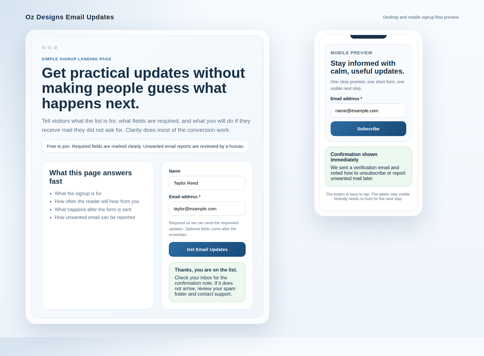
Why email forms get spam, and what “required” really means
Spam does not need a masterpiece of engineering. Most of it only needs a form that is vague, overcomplicated, or too trusting. The usual patterns are boring, which is exactly why they work. Automated submissions hunt for weak labels, missing validation, hidden send paths, and forms that ask too much before they have earned the right.
A form can attract junk for several reasons:
- It asks for unnecessary fields, so the visitor has to hand over more data than the offer deserves.
- It uses unclear labels, so bots and humans can both guess wrong.
- It has no visible trust message, which leaves the visitor to assume the worst because the internet has trained them well.
- It accepts weak or malformed entries, then pretends that a broken submit button is strategy.
“Required” should mean “needed to complete the action the visitor asked for,” not “because the form designer got curious.” That distinction matters. If a field is required, the page should explain why. If it is optional, it should be optional in reality, not just in theory.
Dieter Rams put it better in the design world: “Good design is as little design as possible.” That is the right instinct here. A signup form is not a treasure hunt. It is a transaction. Every extra question needs a reason to exist.
For the operational version of that promise, compare the public Email Application Form page with the separate required email application information page. The first should be easy to complete. The second should explain the minimum needed to make the process work without surprises.
Field-by-field blueprint: what to include and what to keep optional
The basic rule is simple: ask for what you need now, and do not add clutter just to make the page feel busy. Busy is not trust. Busy is what people call the room before they leave it.
| Field | Required or optional? | Why it belongs |
|---|---|---|
| Email address | Required | This is the actual delivery target. If you cannot send the message, the form has not completed its job. |
| First name | Optional unless personalization is part of the offer | Useful if the confirmation or follow-up message needs a greeting that does not sound like it was assembled by a vending machine. |
| Company or organization | Optional | Only include it if the service truly depends on role, account type, or business context. |
| Reason for sign-up | Optional or a short multi-select | Helpful for routing, but not worth a long essay field that turns the form into homework. |
| Phone number | Usually optional | Only ask for it if there is a clear reason to call. A phone number should not be a decorative extra. |
| Consent checkbox | Required if you need explicit opt-in | Use it when the form needs clear permission to send updates or process the submission. |
The safest pattern for a simple free form is still brutal in its efficiency: email address first, one optional detail if needed, and a clear explanation of what happens next. The form should feel like a doorway, not an interview.
Keep the optional fields visually separate from the required ones. That means a lighter rhythm, smaller helper text, and no dramatic emphasis on details that do not matter yet. The visitor should never wonder whether leaving a field blank will break the process. If they have to guess, the form has already failed once.
The “required email address” rule: label it so users don’t guess
The email field is the one place where clarity is not negotiable. If a person cannot tell at a glance what goes there, the form has chosen ambiguity over usability. That is a bad bargain.
Use a visible label above the field. Make the requirement obvious. Do not hide the field purpose inside faint placeholder text that disappears the second someone starts typing. The W3C’s form guidance on labels exists because people kept making exactly that mistake and then acting surprised when forms underperformed.
Good labels
- Email address *
- E-mail address * if the site is intentionally using that older spelling for consistency
- Work email address * if the form truly depends on a business domain
Bad labels
- Contact because that could mean five different things
- Username when you actually want an email address
- Enter here because the obvious answer was apparently too cruel
- Required with no field name, which is less a label and more a warning sign
Put a brief helper line under the field if users might hesitate. For example: “We use this to send your confirmation and account updates.” That sentence does more work than three paragraphs of self-importance ever will.
On the technical side, use the standard email input type rather than a plain text field if your platform supports it. MDN’s email input documentation exists for a reason: the browser can help catch obvious mistakes before the message vanishes into the void.
Add a short trust line: “free of charge” and “you won’t be spammed” in plain language
People do not trust forms because the form is pretty. They trust forms because the page tells the truth quickly and without theatrical nonsense. If the service is free, say so. If the visitor will not be spammed, say that too. Then keep the promise.
That trust line should appear close to the form, not buried halfway down the page after the reader has already decided you are being evasive. The best place is usually just above the button or directly beneath the email field. That is where the visitor is deciding whether to proceed.
Example trust line: “This service is free of charge. We only use your email to send the application details you asked for. You will not be spammed.”
If you need a slightly more operational version, say: “We keep the form short, use your email only for the request you make here, and explain what happens after you submit.”
A useful trust line does three things at once: it states the cost, it states the purpose, and it states the boundary. That is more useful than vague comfort language like “we value your privacy,” which sounds nice and tells the visitor almost nothing.
If your site has a broader explanation of the service, link that text to the homepage so visitors can see the page in context. A trust line works better when the surrounding site is consistent instead of improvising one noble sentence in a swamp of clutter.
Spam handling messaging: what to do if unwanted mail arrives
The page should not pretend that every unwanted message can be prevented. That is fantasy, and fantasy is expensive. What the page can do is tell the visitor exactly what to do if something unwanted arrives after they sign up.
The site’s practical rule is straightforward: if a user receives email they do not want, they should forward the complete message to the spam address with any sender details they can provide. That gives the operator something to inspect instead of a vague complaint and a shrug.
Paste-ready support line
If you receive an email you did not request, forward the complete message to [email protected] and include any sender details or IP information you can see. We review reports, investigate the sending path, and block repeat problems where appropriate.
Notice what that sentence does not do. It does not promise instant salvation. It does not pretend the internet is polite. It simply tells the visitor where to send the evidence and what action will follow. That is how you keep trust intact while still being honest about the mess.
For visitors who need help beyond the form, point them to the contact page rather than making them guess where support lives. And if you want the longer explanation of common junk-mail handling, the blog is the place to put that guidance without stuffing it into the form itself.
If you want a plain external reference for the risk side of email handling, the FTC’s guide to phishing scams is a sensible reminder that suspicious email should be treated carefully, not casually forwarded into more trouble.
Basic anti-spam UX: avoid confusing labels, reduce friction, and confirm intent
Anti-spam UX is not a pile of tricks. It is the boring work of making the form easy for real people and less rewarding for automated junk. The point is to reduce bad submissions without turning the experience into a bureaucratic obstacle course.
Keep the form short enough to survive human patience
If a field does not help complete the request or validate the submission, it probably should not exist. A short form is not a lazy form. It is a form that respects reality. Every extra field slightly increases friction and slightly increases the odds that a visitor abandons the page or invents nonsense just to move on with their life.
Use a calm, visible submit action
The button should say what happens next. “Send application,” “Join the list,” or “Request access” is cleaner than “Submit,” which is the default label of a designer who stopped thinking three meetings ago. The button should also sit close to the fields so the visitor does not have to hunt for the finish line.
Confirm the human’s intent before final submission
Use one clear final action, not three hidden traps. If you do need a second step, keep it simple. For example: “Review and send” or “Confirm details” gives the visitor one last chance to notice mistakes without feeling trapped by the form. That is useful for both people and spam filters.
Avoid puzzles unless the abuse problem forces them
Puzzles, distorted text, and other friction devices are usually a sign that the rest of the form was too weak. Use them only when needed, and do not build the page around the assumption that every visitor is a bot. That mindset is how sites end up punishing the good users to annoy the bad ones, which is a spectacularly inefficient hobby.
| UX choice | What it does | Why it helps |
|---|---|---|
| Clear labels | Reduce guessing | Humans complete the form faster and bots get less ambiguity to exploit. |
| Minimal fields | Lower friction | Fewer unnecessary requests means fewer abandoned submissions and fewer random entries. |
| Intent confirmation | Checks the final action | The visitor sees one final chance to catch mistakes before the form goes live. |
| Simple validation | Stops obvious errors | A malformed email address should not get a reward and a thank-you message. |
Privacy-friendly confirmation copy: what users should expect after subscribing
The confirmation screen is not the place to become poetic. It is the place to tell the visitor what happened, what happens next, and whether they need to check their inbox. That is all. Drama is for films and failed product launches.
Good confirmation copy usually answers five things:
- Was the submission received?
- Is any verification needed?
- What email address will receive the follow-up?
- How long should the visitor wait?
- What should they do if the message does not arrive?
Example confirmation copy: “Thanks. Your request is in. We will send the next step to the email address you provided. If the message does not appear in a few minutes, check your spam folder and then contact us through the contact page.”
That line is privacy-friendly because it does not overshare, and it is useful because it tells the visitor exactly where to look next.
If your process uses a double-check or verification step, say that plainly. Do not hide it behind vague language like “almost done” when there is still another email step waiting offstage. People do not enjoy being misled by cheerful half-truths.
When the confirmation message fits the rest of the site, the visitor can move from the form to the blog or back to the homepage without feeling like they have landed in a separate system run by a different species.
Quality checklist before you publish: validation, required fields, error states, and confirmation screen
Before the page goes live, I would run the boring checklist first. Boring is good here. Boring catches the errors that make the site look amateurish once the first real visitor arrives.
Validation checklist
- Every required field is visibly labeled.
- The email field uses an email-specific input or validation rule.
- Error messages explain the fix in plain language.
- The form prevents obviously broken submissions without making the page feel hostile.
- Optional fields stay optional in both label and behavior.
Error-state checklist
| Problem | What users should see | Better than this |
|---|---|---|
| Invalid email format | “Enter a valid email address.” | A red outline with no explanation. |
| Missing required field | “Email address is required.” | The form silently refusing to move on. |
| Submission error | A clear retry message and support route. | A generic “something went wrong” tombstone. |
Confirmation-screen checklist
- The visitor sees that the request was received.
- The page explains whether a follow-up email is coming.
- The page tells the visitor what to do if no message arrives.
- The page links to support without making them search.
- The page does not ask for the same data a second time for no reason.
Do one final pass on mobile. If the label wraps badly, the button clips, or the trust line disappears below the fold, the desktop version is lying about the real experience. Mobile is where weak layouts go to be exposed.
If you want the surrounding site structure to stay consistent, check the services page for tone, the contact page for support paths, and the blog for related articles. A signup form does not need to look fancy. It does need to look intentional.
Final checklist before you publish
Use this as the last preflight. If a visitor can complete the form without guessing, the form is doing its job. If they have to interpret it, you have already made them work for your convenience.
- The email field is clearly labeled and required.
- Only the fields that truly matter are required.
- The trust line says the service is free of charge and not spammy in plain language.
- The form tells users what to do if unwanted mail arrives.
- The confirmation message explains the next step and where to look for it.
- The error states are human-readable, not cryptic.
- The page works on mobile without awkward zooming or clipped text.
- The support path is visible through the contact page and related help pages.
The simplest form wins for a reason. It keeps the promise visible, it lowers the chance of junk submissions, and it gives real users fewer chances to trip over the process. Not glamorous. Just effective. Which, in forms, is usually the whole point.