From Idea to Email Signup: A Simple Landing Page Template That Gets Subscriptions
Paste-ready copy blocks you can reuse
These blocks are written to match a simple promise: the service is free to join, required fields are explained, and unwanted mail concerns have a clear path. Adapt the placeholders, but keep the boundaries intact.
Headline block
Get {benefit} for {audience} by email, with a clear next step after signup.
Short value statement block
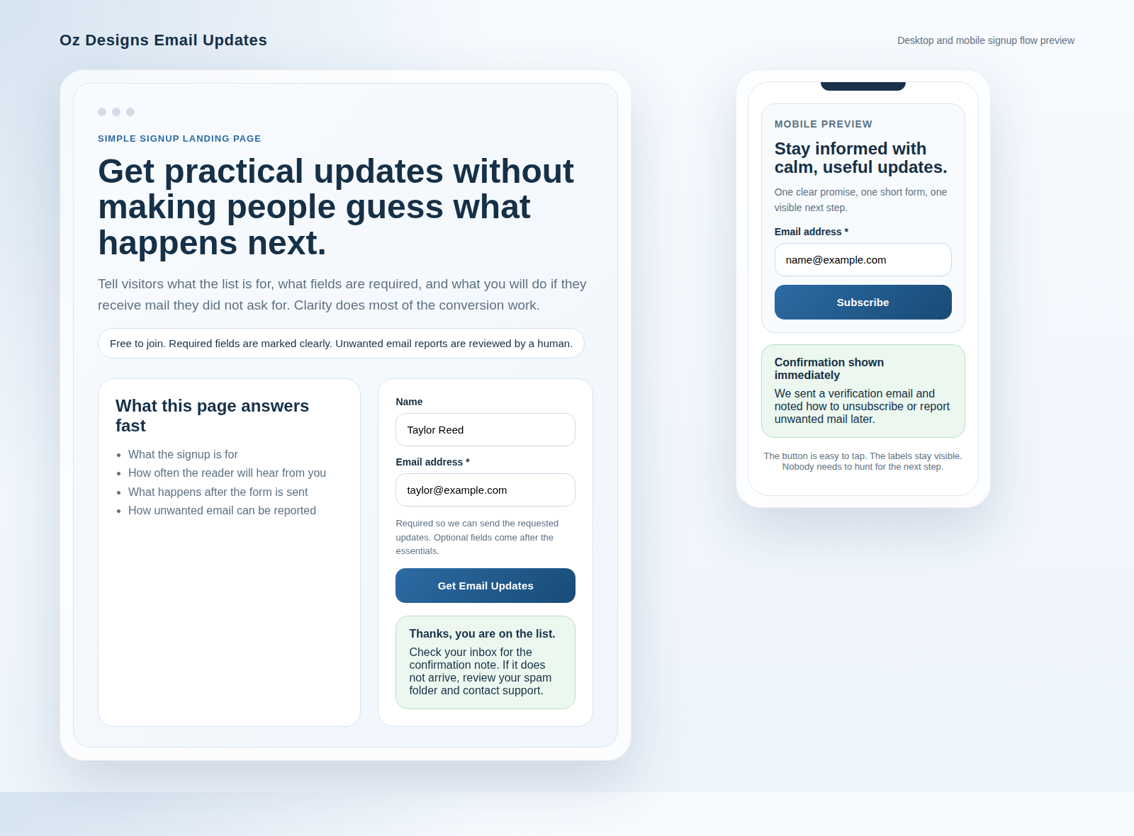
Receive {type of update} when we publish or release something relevant. We keep the form short, explain what is required, and tell you what to expect after you join.
Required fields explanation block
Fields marked required are needed to send the updates you requested and confirm your signup. Optional details come later, after the essential information is in place.
Reassurance and unwanted-email handling block
Joining is free of charge. We send only the updates described on this page. If you receive a message you did not expect or no longer want, forward the full email to {support address} with any sender details you can provide. We review reports, investigate the sending path, and block repeat problems where appropriate.
That last sentence is important because it is operationally honest. It does not promise perfection. It tells the visitor what to do, what you will review, and what happens next.
Form UX checklist: make it easy to say yes
Most signup pages do not fail because the offer is weak. They fail because the form adds friction or confusion. Run this checklist before you publish:
- Keep required fields minimal. Usually that means email address first, then name only if it serves a clear purpose.
- Use visible labels. Do not rely on placeholders as the only field descriptor.
- Add helper text where the reader may hesitate. A one-line explanation under a required field can prevent a preventable abandonment.
- Use specific button text. “Get updates,” “Join the list,” or “Send me the guide” is better than a lonely “Submit.”
- Show friendly, actionable errors. Tell the visitor what is wrong and how to fix it. “Enter a valid email address” is enough. A red border alone is not a sentence.
- Confirm the submission immediately. State whether the signup is complete, whether a verification email is coming, and how long that step usually takes.
| Form element | Minimum safe version | Common failure mode |
|---|---|---|
| Field order | Email, then optional details. | Leading with low-value questions. |
| Labels | Visible above the field. | Placeholder-only labels that vanish while typing. |
| Errors | Short instruction plus clear focus state. | Silent failure after pressing the button. |
| Confirmation | Immediate thank-you and inbox guidance. | No message, or a redirect to an unrelated page. |
One small point that matters: do not make people hunt for the button. The CTA should sit close to the final field, look clickable, and remain easy to tap on mobile.
Spam-reduction messaging that is accurate and helpful
Spam, in this context, means unsolicited or unwanted email that the user did not knowingly opt in to receive. That definition matters because it draws a clean line between a requested newsletter and an unwelcome message.
Explain the opt-in boundary
The visitor agreed to the messages described on the page. That is the boundary. If the content, frequency, or sender identity drifts too far from the promise, trust weakens and complaint risk rises.
Give a clear reporting path
Your page should tell people what to do if they receive email they do not want. A useful instruction is short and practical: forward the full message to a support address, include sender details if available, and avoid replying to the unwanted message itself.
State what you will do next
Say that reports are reviewed, sending paths are investigated, and repeat abuse can be blocked. Avoid language that implies you can stop every bad message everywhere. That is not a promise any careful operator should make.
Paste-ready reporting note
If you receive a message that you did not request, forward the full email to our support address with any sender details you can provide. We review reports, investigate the sending source, and block repeat problems when the evidence supports it.
Optional add-ons: FAQ and a short privacy note
Use these sections when the signup promise needs a little more reassurance, not because every landing page must become a policy document.
FAQ
How often will I receive email?
Use the actual cadence your team can support: weekly, occasional, or only when there is something new to send.
What does “required” mean on the form?
It means the field is necessary to process the signup or deliver the requested updates. Optional questions should stay clearly separate.
What happens after I sign up?
Tell the visitor whether they will see a thank-you message, receive a verification email, or land on a confirmation page.
How do I unsubscribe or change preferences?
Provide a simple route: an unsubscribe link in the email, a preference center, or a support contact on the contact page.
What is PoP3, and does it matter here?
PoP3 is one way email can be retrieved from a mailbox. It matters only if your signup flow relies on a specific mailbox setup behind the scenes. For most visitors, the priority is whether the signup confirmation arrives and whether support can help if it does not.
Short privacy note
Collect the minimum data needed for the signup, say how it is used, and explain how the reader can manage preferences later. Keep the note operational: email address to send updates, optional fields for context, and an unsubscribe path for future changes.
Mobile and accessibility checks before you publish
This is the final quality gate. The page can read well on a desktop and still fail on a phone or keyboard-only pass. Verify these items before the link goes live:
- Mobile layout: no zoom required, no clipped text, and the button is comfortably tappable.
- Performance: the page loads quickly, the image is optimized, and the form does not wait on heavy scripts before becoming usable.
- Label associations: every field has a visible label and a proper programmatic association.
- Keyboard path: tab order is logical, focus states are visible, and the submit action can be reached without a mouse.
- Error announcements: validation text is readable, specific, and available to screen readers.
- Contrast: button text, helper text, and error states stay readable against their backgrounds.
- End-to-end test: submit one valid signup and one invalid attempt, then confirm the thank-you or verification message behaves exactly as described.
If you want the article context to align with the wider site journey, check the homepage for positioning, the services page for service framing, and the blog for related guidance. The signup page should feel like part of the same system, not a detached experiment.
Quick rollout plan: A/B tests and what to measure
Do not rebuild the whole page every week. Change one controlled element at a time, measure the result, and keep the version that reduces friction without damaging list quality.
- Test the headline. Compare a straightforward promise against a benefit-led variation.
- Test reassurance placement. Place the “free to join / clear reporting path” line above the form in one version and below it in another.
- Test button text. Compare “Subscribe” against a more specific CTA such as “Get email updates.”
- Test required-field helper text. Sometimes one sentence explaining why the email field is required removes a quiet source of hesitation.
Primary metric: conversion rate, measured as signup submissions divided by page views.
Quality metrics: unsubscribe rate, bounce rate, and unwanted-email reports or complaint signals when available.
Cadence: make small changes, let the page collect enough traffic to mean something, then keep the better version. Order is expensive; random tinkering is merely noisy.
Final check before you publish
Read the page once as the operator and once as the visitor. The operator checks field logic, confirmation behavior, and reporting paths. The visitor checks a simpler question: do I understand the promise, the required fields, and the next step without having to guess?
If the answer is yes, the page is ready for traffic. If not, tighten the promise, shorten the form, and verify the confirmation flow before you ask for more clicks. If you need help aligning the signup page with the rest of the site, start with the services page, use the contact page for support questions, or review other guidance on the blog.