Web Design Trends: What’s In and What’s Out for 2024
Web design trends don’t change because someone ran out of ideas. They change because users, devices, and browser capabilities changed—and your site either keeps up or pays the usability tax.
When you’re searching for what’s in and what’s out for 2024, you’re usually asking:
“What should I copy without breaking what already works?”
“Which visual trends actually improve readability and conversions?”
“What layout choices are becoming outdated?”
“How do I future-proof without redesigning every week?”
According to Mozilla’s guidance on web performance (understand page performance), speed and usability are not optional details—they’re core to how users experience the web. Meanwhile, Google’s Core Web Vitals (measurement framework) gives teams a practical way to decide whether UX improvements are real.
By the end of this guide, you’ll have a decision checklist for 2024 design choices—plus a few “don’t waste your time” signals you can use while reviewing your own homepage, service pages, and blog layout.
Table of contents
- Overview of 2024 trends
- Color palettes and typography
- User experience innovations
- Responsive design that’s tested, not assumed
- Case studies of trendsetting websites
Overview of 2024 trends
Here’s the pattern I’d bet on for 2024: design trend = usability improvement + technical capability. The visual style matters, but the “in” trends usually share a common trait—they reduce friction.
Use this quick filter:
- In: choices that improve readability, reduce time-to-understanding, or make interaction predictable.
- Out: choices that rely on fragile behavior (tiny text, low-contrast UI, “cute” motion, or layout jumps) and only look good at one screen size.
Practical next step: review your key templates (homepage hero, services section, and your call-to-action blocks). If a “trend” doesn’t improve those templates, it’s probably decoration—not strategy.
Color palettes and typography
2024 typography is less about “what’s fashionable” and more about what survives real browsing conditions: small screens, bright sunlight, older displays, and accessibility settings.
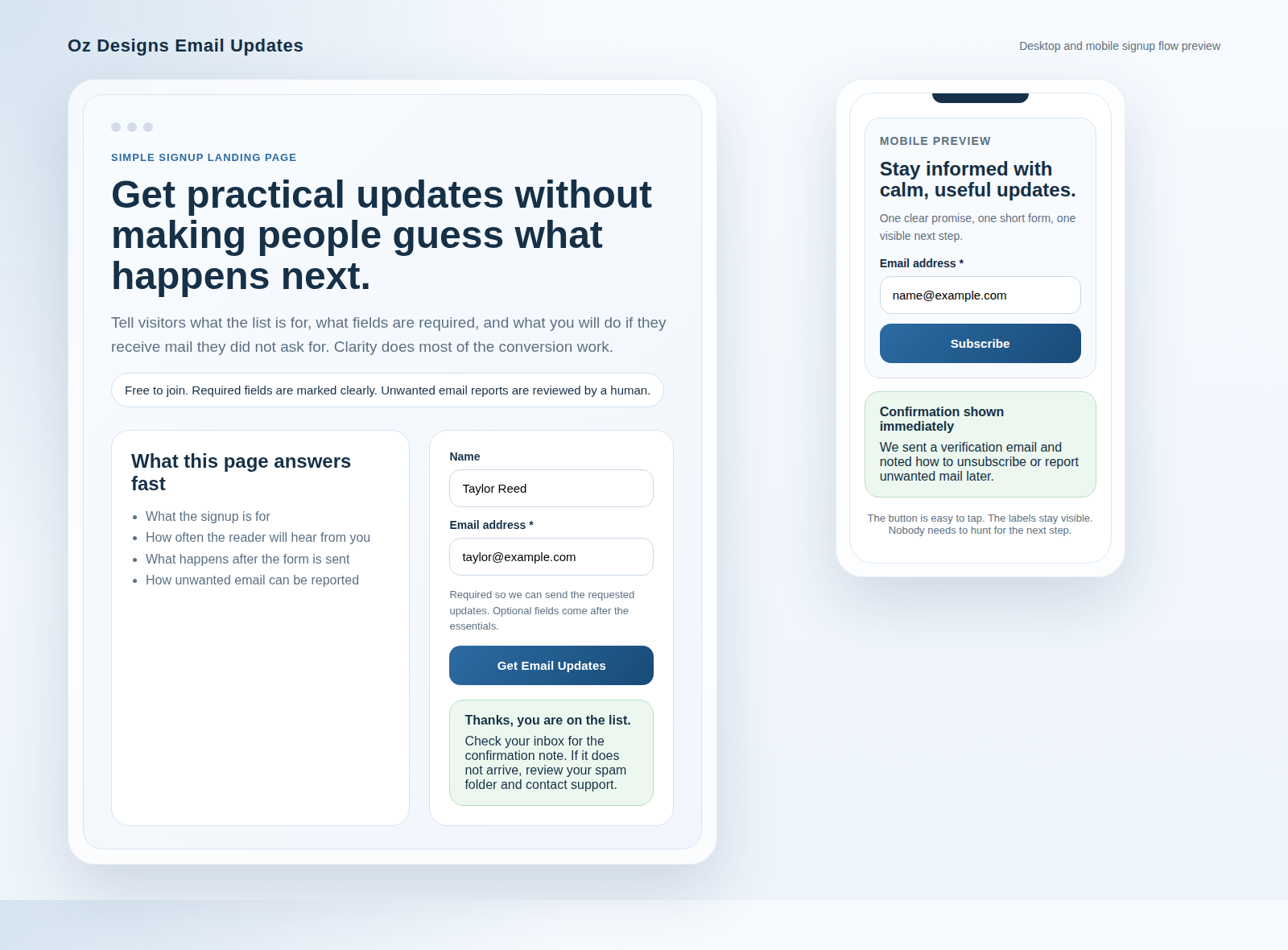
Color palettes: higher contrast as a feature
Many modern palettes are calmer (fewer harsh gradients, fewer neon accents), but the important part is contrast discipline. If you’re using background imagery, make sure your text layers and buttons still read cleanly.
- Prefer one primary, one accent, and disciplined neutrals.
- Test button contrast in both desktop and mobile sizes.
- If you add decorative visuals, avoid placing essential copy on top of complex backgrounds.
Typography: readable rhythm beats novelty
Good 2024 typography feels “quietly confident.” It uses consistent heading hierarchy and line-length control.
- Headings: clear size steps; avoid “almost the same” sizes.
- Body text: aim for comfortable line length and consistent spacing.
- Buttons/labels: keep text short and specific (e.g., “Request info” instead of “Submit”).
If you’re building or tightening CTAs, the internal guide on web button copy can help you choose language that reduces hesitation.
User experience innovations
The biggest UX “in” trends aren’t always flashy. They’re often the boring stuff done well: navigation clarity, faster interactions, and form designs that prevent mistakes.
1) Predictable interaction (less mystery, fewer surprises)
Users should understand what will happen before they click. That means:
- Buttons look clickable and behave consistently.
- Hover/focus states are visible and keyboard-friendly.
- Forms explain what success means and what happens next.
2) Micro-UX for forms: fewer errors, less backtracking
Many conversion problems come from avoidable friction: confusing labels, missing context, and unclear expectations. A practical pattern is to:
- Label fields with the user’s intent (what they’re trying to do).
- Use plain-language prompts and examples when relevant.
- Provide a confirmation message that tells people what to do next.
Related: start with the email application form template and make sure the form flow matches your audience’s expectations.
3) Performance as a UX feature
“Fast” is not a trend—it’s a foundation. Design decisions that require heavy assets, constant layout shifts, or complex scripts can undercut even a beautiful UI. If you want a measurement framework, Core Web Vitals can guide what to fix first: https://web.dev/vitals/.
Responsive design that’s tested, not assumed
Responsive isn’t just a CSS setting. It’s an evidence-based guarantee that the page does what you intend under real constraints.
What to test in 2024 (minimum set)
| Area | Test | What “good” looks like |
|---|---|---|
| Hero section | Mobile width + zoom | Headline stays readable; CTA remains visible |
| Typography | Long lines on small screens | Line breaks and spacing remain comfortable |
| Buttons/links | Tap targets + spacing | Easy to tap without mis-clicks |
| Images | Crop behavior | Important content isn’t hidden |
| Forms | Error state on mobile | Clear messages and easy correction |
Responsive mistakes that are quietly “out”
- Text that gets smaller instead of reflowing.
- Layout shift when images load or fonts swap.
- Navigation that collapses into confusion (links become hard to find or too crowded).
Case studies of trendsetting websites
Instead of chasing “top 10 trends” lists, examine the decisions. Look for patterns in the pages that feel easier to use—then adopt the logic, not the cosmetics.
What to look for when you analyze a trendsetting site
- Hierarchy: can you scan it in 10 seconds?
- CTA clarity: does the page tell you what to do next?
- Contrast: is the text readable against its backgrounds?
- Interaction: does it behave predictably on touch?
Two reference sources (for practical design + performance)
Conclusion: pick trends by decision criteria
If you want a simple 2024 decision rule, use this:
Choose the trend only if it improves readability, predictability, and speed—on both desktop and mobile.
Then apply it to your homepage and your primary conversion page first. If those improve, the “trend” is earning its place.
For next steps, compare your current layout with OzDesigns.net service sections and update your CTA and typography hierarchy before you start changing colors.