Web Button Copy That Gets Clicks: 12 Clear CTA Examples
I keep seeing the same quiet failure on small websites: the button is technically present, but the copy never says what the visitor is about to do.
People land on a page and ask four fast questions: What happens if I click? Will this cost me anything? Is this a form, a signup, or a sales pitch? And where do I go if I want the short version? Steve Krug’s classic warning still holds: “Don’t make me think.” A button that hides its outcome makes the user do the thinking your interface should have done already.
The mechanics are not mysterious. The HTML <button> element exists for real actions, not decorative mystery meat. Accessibility guidance and UI design research keep landing on the same point: buttons should describe the action, not the chrome around it. I use that rule whenever I write button copy for a small site, because a small site has less room to be vague and even less room to be cute.
In this guide, I’ll show you 12 clear button examples, explain why vague labels underperform, and give you a small decision framework you can use on your services page, your contact page, and your home page. I’ll also show where first-person wording helps, where it gets awkward, and how to check whether a label is doing its job before you publish it.
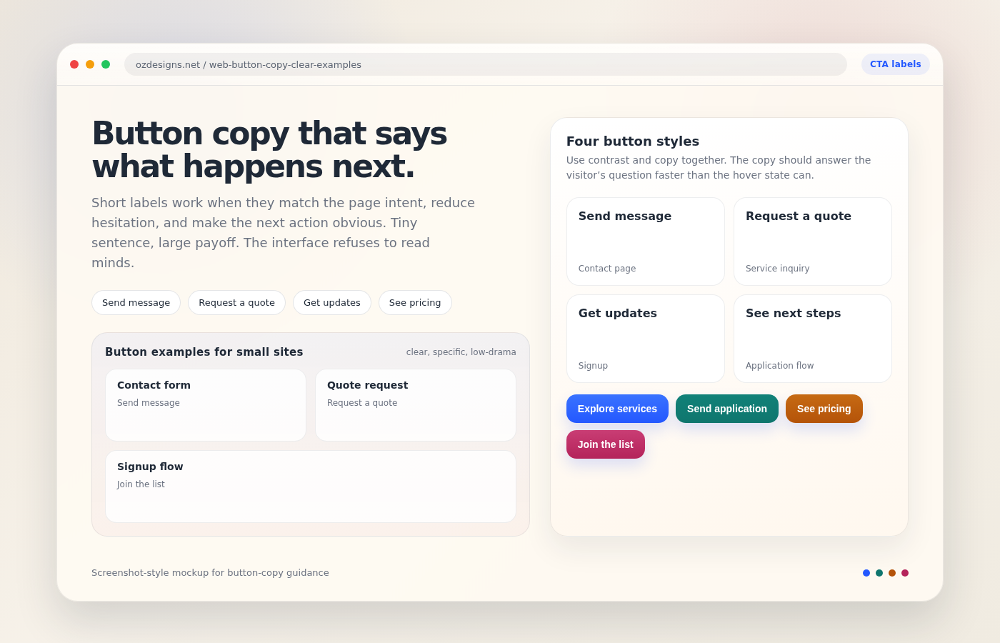
Why vague button text underperforms
“Submit” is not a sentence. It is a shrug with a border radius. On a small business site, vague button text creates three kinds of friction at once: it hides the outcome, it increases the sense of risk, and it gives the visitor no reason to trust the next step. If the page is asking for contact details, a vague button makes the whole form feel more like a form than a conversation.
That matters because button copy is not isolated copy. It sits at the point where intent becomes action. A reader can tolerate a fuzzy headline for a few seconds. They are much less patient with a button that turns the final step into a puzzle. That is why strong labels usually do one of four things:
- name the action clearly,
- name the object of the action,
- signal what happens next, or
- reduce the emotional cost of clicking.
Design teams sometimes try to rescue weak labels with color, shadow, or motion. Sometimes that helps. Mostly it just gives the weak label a nicer jacket. The copy still has to do the real work.
For forms specifically, the same lesson appears in WebAIM guidance on form controls: the user needs a clear relationship between the field and the action. If the button says “Continue,” the page should make it obvious what the user is continuing. If it says “Send message,” the page should make it obvious what message is going where.
12 clear button copy examples for small sites
Here is the pattern I reach for when I want the button to do its job without drama. The left-hand column is the weak label I would usually retire; the middle column is the clearer replacement; the right-hand column is the reason it works.
| Page or goal | Avoid | Better button copy | Why it works |
|---|---|---|---|
| Contact form | Submit | Send message | It tells the visitor exactly what will leave the page. |
| Contact form | Click here | Ask a question | It matches the real job of a simple contact form. |
| Quote request | Get started | Request a quote | It lowers ambiguity and sets an expectation that feels fair. |
| Pricing page | Learn more | See pricing | It gives the reader a concrete payoff instead of a vague promise. |
| Services page | Read more | View services | It points to the actual content behind the button. |
| Services page | Start now | Choose a service | It turns a general nudge into a specific decision. |
| Signup form | Sign up | Join the list | It sounds lighter, more human, and less like a legal agreement. |
| Newsletter | Subscribe | Get updates | It tells the reader what they are receiving, not just what they are doing. |
| Lead magnet | Download | Get the checklist | It names the asset, which makes the click feel more tangible. |
| Application page | Apply | Send my application | First-person wording can make the action feel direct and personal. |
| Next step page | Continue | See next steps | It removes the guesswork about where the user is going. |
| Homepage CTA | Go | Explore services | It gives the home page a directional label instead of a dead verb. |
If I had to compress that table into one rule, it would be this: the stronger button label sounds like the answer to a question the visitor already has. “What do I do here?” “What do I get?” “What happens after this?” Good button copy answers those questions before the user has to ask them.
Contact and quote buttons
Contact and quote buttons live in the easiest part of the site to overthink. Small sites often use “Submit” because it feels generic and safe. In practice, “Submit” is safe only for the site owner. The visitor still has to decode it. I prefer labels that reflect the actual exchange:
- Send message for a simple contact form.
- Request a quote when the page is about pricing or a custom project.
- Book a call when the next step is a conversation, not a form graveyard.
- Ask for a callback when the site explicitly offers that support path.
Those labels work because they reduce the sense of risk. The visitor can predict the outcome. That prediction is what clicks on a small site are made of.
On the Contact page, for example, I would rather see one button that says Send message than three polished variants that all say the same thing in a slightly more expensive font. Clear beats decorative every time. The button is not there to impress the design critic who lives in your head. It is there to get a human being from hesitation to action.
Signup and mailing-list buttons
Signup copy is where small sites often become accidentally formal. “Subscribe” can work, but it can also feel like a billing relationship before the visitor has even seen the value. “Join the list” and “Get updates” often feel more honest because they explain the reward in plain language. If the list has a concrete purpose, name it:
- Get the checklist for a download.
- Join the mailing list for occasional updates.
- Receive design tips if the email content is genuinely useful.
- Get project ideas if the signup is tied to inspiration or examples.
If you want an example from this site’s own structure, the Email Application Form should not hide behind a vague button like “Submit.” It should promise the actual next step, such as Apply now, Send application, or Join the list. A reader should not need a decoder ring to understand a button. Small sites do not need mystery. They need momentum.
How to match button copy to page intent
I use a simple rule: the button should match the page’s job, not the designer’s mood. If the page’s purpose is to educate, the button should point to the next useful action. If the page’s purpose is to capture a lead, the button should make the exchange feel fair. If the page’s purpose is to sell a service, the button should lower uncertainty, not inflate excitement.
The W3C WAI form labels guidance points the same way: the label should make the action obvious before the click, not after the user has already committed.
Here is the decision frame I use when I’m editing a small site:
| Page intent | What the button should promise | Good examples | What to avoid |
|---|---|---|---|
| Home page | A useful destination | Explore services, View work, See how it works | Go, Start, More |
| Services page | A clear overview or next action | View services, Request a quote, Contact us | Learn more, Continue, Submit |
| Contact page | A reply or message flow | Send message, Ask a question, Book a call | Click here, OK, Submit |
| Signup page | The exact reward or subscription type | Get updates, Join the list, Download the guide | Sign up, Subscribe, Join now |
| Application page | The form’s final outcome | Send application, Apply now, Start application | Proceed, Continue, Go |
That last line is useful because it keeps your copy honest. “Proceed” is what airport staff say when they do not want to tell you the gate number. Your button should know better.
When I’m checking a page, I also ask whether the button copy can survive three states:
- the reader sees it on a phone,
- the reader sees it without reading the whole page, and
- the reader sees it after a long day and no interest in decoding brand poetry.
If it fails any one of those tests, I rewrite it.
Use verbs people actually use
One trick I rely on is to strip the button down to the verb the user would say out loud. Not the most elegant verb. The honest one. If the visitor wants to contact you, “Send message” feels natural. If they want to compare services, “View services” feels natural. If they want to get the next step, “See next steps” feels natural. Natural usually beats clever. Clever tends to age into confusion, which is the least glamorous kind of technical debt.
Nielsen Norman Group’s button design guidance keeps pressing the same advantage: the label should describe the action, not decorate it.
That said, I do not try to make every button sound the same. Repetition is useful only until it becomes wallpaper. The button on a services page should not mimic the button on a newsletter signup page. The intent is different, so the wording should be different.
When to use first-person wording
First-person button copy can help when the interaction is personal, low-risk, and clearly owned by the visitor. I use it when the action feels like the user is asking for something specific: Get my quote, Send my message, Download my checklist. The word my can make the action feel immediate instead of generic.
But first-person wording is not a magic wand. Overuse it and the page starts sounding like a chatbot that has eaten a brochure. I would avoid first-person copy when:
- the action is formal or legal,
- the page has multiple audiences,
- the wording becomes awkward in the user’s mouth, or
- the sentence starts sounding like a tiny manifesto.
Here is the simple test I use:
- If the user would naturally say “Send me the quote”, first-person copy may help.
- If the user would naturally say “Request a quote”, keep it neutral.
- If the user would never say either phrase aloud, the button probably needs a rewrite, not a cleverer personality.
On a small site, first-person wording works best when it removes distance. It should sound like the user is taking possession of the action, not like the page is narrating the user’s life back to them.
A quick rewrite method for messy buttons
When I inherit a page with weak button text, I do not start by inventing clever copy. I start by naming the outcome in plain English. That sounds almost too simple, which is usually how useful systems behave before people add theatre.
- Write the destination. Ask what the button actually leads to: a message, a quote request, a pricing page, a form, or a download.
- Choose the cleanest verb. Keep the verb close to the user’s intent: send, request, view, join, get, book, see.
- Remove filler words. If the label still works without “now,” “more,” or “here,” leave them out.
- Read it with the page heading. If the heading says one thing and the button says another, the page is talking with two mouths.
This method works because it keeps the rewrite grounded in function. I am not trying to make every button sound brilliant. I am trying to make the next step obvious enough that the reader never has to stop and negotiate with the page. A small site does not need a chorus of calls to action. It needs one clear path at a time.
Here is the simplest before-and-after version of the method:
- Before: “Submit”
- After: “Send message”
- Before: “Learn more”
- After: “See pricing”
- Before: “Get started”
- After: “Request a quote”
Nothing fancy. Just fewer guesses. That is usually enough.
If you are stuck between two decent labels, choose the one that names the outcome rather than the process. Send message is better than Continue because it describes the result. See pricing is better than Learn more because it respects the reader’s intent. The button is the last sentence on the page, and the last sentence should be the clearest one.
A final review checklist for clarity
Before I publish a button label, I run through a short checklist. It takes less time than a round of stakeholder comments and usually prevents one.
- Can I say the result in one breath? If not, the label is too vague.
- Does the button name the action or the destination? One of those should be obvious.
- Would a new visitor understand the click without reading the whole page? If not, rewrite it.
- Does the label match the page intent? A services page should not sound like a login screen.
- Is there a better verb? “Send,” “View,” “Get,” “Book,” and “Request” do a lot of useful work.
- Does the copy still make sense on mobile? Small screens punish ambiguity faster.
- Would I trust this button if I saw it in isolation? That is the real test.
- Did I avoid filler? If the label could be replaced with “Submit” and nothing changes, it still needs work.
If you want one more source for that habit, the broader lesson is consistent with the WebAIM forms guidance: clarity lowers friction. That is the whole game, and it is a boring game only if you think the boring parts are optional.
Conclusion
Button copy is tiny, but it sits at one of the most important seams on a website. It is where the page stops talking and the visitor has to act. When the label is vague, the seam frays. When the label is specific, the page feels calmer, cleaner, and more trustworthy.
If you only remember one thing, make it this: write the button like a promise, not a placeholder. “Send message” beats “Submit.” “Request a quote” beats “Get started.” “Join the list” beats “Subscribe” when you want the signup to feel human instead of ceremonial.
For small sites, that difference matters because every click has to earn its keep. There is no room for interface poetry that forgets the plot. If you want a practical next step, review your Services page, your Contact page, and the Home page, then rewrite any button that could still make sense after the user closes their eyes and tries to guess what it does. That is a decent standard. It is also a merciless one, which is usually how good interfaces behave.
Key points to remember:
- Specific button text lowers friction and reduces uncertainty.
- “Submit” and “Click here” are usually too vague for small sites.
- Match the button to the page’s job: contact, quote, signup, or next step.
- First-person copy works when the action is personal and direct.
- Clarity beats cleverness, especially on mobile.