A Small Business Guide to Email Sign-Up Forms That Feel Trustworthy
Visitors will decide whether your email sign-up form feels safe in seconds. If it looks vague, pushy, or “too good to be true,” they hesitate—and most people don’t come back to try again later.
This guide is for small businesses that want a simple sign-up flow that looks legitimate, respects attention, and reduces friction without adding heavy technical complexity.
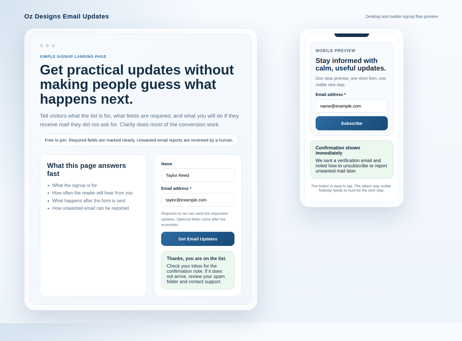
What visitors look for before submitting a form
Most hesitation isn’t about the browser—it’s about trust. Before a visitor types anything, they’re scanning for these signals:
- Clear purpose: A headline or short sentence that tells them what they’ll get.
- Low surprise: The form doesn’t feel like it’s collecting more than it needs.
- Consistent branding: The form matches the look of the rest of your site.
- Honest expectations: Frequency and “what happens next” are understandable, not hidden.
- Visible opt-out path: Unsubscribe instructions are easy to find.
- Legitimacy cues: Contact page link, an about page, and readable privacy wording.
If any of those are missing, visitors often assume the worst: that their email will be shared, spammed, or used without consent.
For visitors who land on related pages, it helps when navigation feels consistent. Consider linking to your contact page and about page near the form so they have an immediate “real person” path.
Which fields are essential—and which are optional
Short forms convert better. The trick is choosing the smallest set of fields that still lets you do what you promised.
| Field | When it’s essential | When you can skip it |
|---|---|---|
| Email address | Always—this is the purpose of the form. | Don’t skip it. |
| Name | If you will use it for personalization (e.g., “Hi Maya”). | If you’ll only send generic updates, you can keep it optional. |
| Phone number | Only if SMS is truly part of the offer. | If not, omit it. Collecting extra data increases friction and anxiety. |
| Company / role | If you need segmentation (e.g., for business vs. personal offerings). | For a basic newsletter, keep it out. |
| Checkbox consent | When your marketing or legal basis requires explicit consent language. | If you truly don’t do marketing emails (rare), you may not need it. |
Practical rule: collect only what you will use, and explain what you’ll do with it right next to the fields—not buried in a long policy document.
How to explain privacy and follow-up clearly
Privacy language should feel like plain-English housekeeping, not a legal maze. Include three small pieces of clarity:
1) What you’ll send
Example: “Product updates and occasional tips.” Avoid vague promises like “news” if you can’t define what “news” means for you.
2) How often
Example: “About 1–2 emails per month.” If you don’t know yet, start honest and conservative (and actually follow through).
3) What happens next
Will they get a confirmation email? Will you verify address ownership? Will there be an unsubscribe link? Say it.
For policy depth (without cluttering the form), link to your privacy policy and make sure it matches your form wording.
Where relevant, you can also align with widely used guidance on consent and user choice. For example, Google’s documentation on privacy/security concepts can help you understand what users expect from browser-facing and site behavior: Google Analytics help: privacy and consent. (This won’t replace your own legal review, but it’s a useful trust reference.)
Placement tips for homepage and contact pages
Where you put the form changes what people assume about it.
Homepage: make it feel like an invitation
- Use a visible section headline (“Get email updates” or “Join the list”).
- Place it near clear proof (testimonials, examples of past updates, or a brief “what you’ll receive”).
- Keep the submit button text direct: “Subscribe” is enough.
Since visitors often arrive from the homepage first, a link back to the core starting point can also help orientation: OzDesigns.net.
Contact page: reduce the “should I worry?” moment
People coming from your contact page are already in communication mode. A sign-up on that page can work well if it doesn’t interrupt the primary purpose.
- Keep it secondary (“Prefer updates? Join the list.”).
- Use a calmer design so the contact form and email form don’t feel like the same thing.
- If you add a note about unsubscribe, keep it short and consistent.
A trust checklist for form design
Before publishing, run this quick checklist. If you can’t answer a question below, the form still feels risky—even if the details are “technically correct.”
- Purpose is visible within the first line above the fields.
- Fewer fields than you want to collect (and you only ask for what you’ll use).
- Clear frequency is stated (or explicitly conservative).
- Follow-up is explained (confirmation email, expected timeline, etc.).
- Unsubscribe is promised and the path is easy to find.
- Privacy link matches the form (no contradictions).
- Contact/identity signals exist (link to contact or about nearby).
- Button text is honest (no “guaranteed,” no pressure).
- Confirmation message sets expectations (“Thanks—check your inbox for verification.”).
If you want a simple final improvement: rewrite the line under the form headline last. That microcopy is where trust is built or lost.
Example: a trustworthy sign-up snippet you can copy
Headline: Get email updates
Subhead: Occasional tips and announcements. Unsubscribe any time.
Button: Subscribe
Small note under the button: We’ll send a confirmation email before your subscription is active.
Next steps
If you review one thing this week, review your form’s headline, subhead, and confirmation message. Those three elements are where “feels trustworthy” becomes “works smoothly.”
Sources for consent and privacy concepts: GDPR overview (plain explanation), FTC guidance hub (privacy and consumer protection), and IANA media types overview (for general standards literacy).