
Designing a Simple “Request Info” Email Application Form That Gets the Right People
A simple request-info form can do two jobs at once: invite the right people in and quietly filter out the wrong ones. The trick is not to ask for everything. The trick is to ask for the right few things, explain why you are asking, and make the next step feel obvious.
If you are building or refining an email application form, you are probably asking the same practical questions visitors ask: What do I have to fill out? Why do you need it? What happens after I press send? And will I end up on a list I never asked to join? That is the real work of form design. If the answers are clear, good people keep going. If the answers feel fuzzy, they leave.
This guide uses a plain, low-friction approach you can apply on a small business site or a service page like the Email Application Form. If you want the shorter version of the promise, the Required Email Application Form page is also a helpful reference. The point here is to make the form feel useful, not crowded.
By the end, you will know which fields to keep, which ones to drop, how to write friendlier copy, what to say on the confirmation screen, and how to set expectations without sounding like a policy document. You will also have a copy-paste template you can use as a starting point.

Why request info forms fail
Most weak request forms fail for the same three reasons. They ask for too much, they promise too little, or they confirm almost nothing after submission. None of that is mysterious. It is just friction.
- Too many fields make the form feel like homework. Visitors stop answering honestly once the questions feel nosy or slow.
- Unclear promises make people wonder whether the form is a lead trap, a mailing list sign-up, or a support request disguised as something else.
- Weak confirmation messages leave people unsure whether the form worked. That uncertainty turns into repeat submissions, support emails, or abandonment.
Nielsen Norman Group’s guidance on web form usability points in the same direction: keep the layout clear, keep labels visible, and do not make users guess what a field means. That is boring advice in the best possible way. Boring forms convert.
If your form is meant to collect serious requests, it should feel like a careful conversation, not a scavenger hunt.
Field by field: what to ask for and what to avoid
The best request-info forms are narrow. They gather only what you need to reply, route the request, or keep the exchange from breaking later. Every extra field should earn its place.
| Field | Keep it? | Why it helps | Notes |
|---|---|---|---|
| Email address | Yes, required | You cannot reply without it. | Use a clear label and the correct input type so mobile keyboards help the user. |
| Name | Usually yes, but keep it simple | Makes the reply feel human. | First name is often enough unless you truly need a full legal name. |
| What they need help with | Yes | Routes the request and sets expectations. | One short text area beats five tiny checkboxes. |
| Company or website | Optional | Helpful when requests are business-related. | Make it optional unless it changes the response path. |
| Phone number | Usually optional | Useful only if you will actually call. | Do not make people share a phone number just because the form allows it. |
| Budget | Only if needed | Can save time on service matching. | Use a range instead of a hard number if that reduces hesitation. |
| Message subject | Usually no | Redundant if you already have a message field. | Two places to explain the same thing are often one place too many. |
| Company size, referral source, referral code, industry, and so on | Only when there is a clear use for each one | Can help segmentation. | If the answer will not change what happens next, leave it out. |
For accessibility and browser help, the MDN autocomplete reference is worth keeping nearby. It explains which fields can benefit from browser assistance, and it is one of those small details that saves people from typing the same thing twice.
What I would not ask for on a first pass
- Exact address fields, unless the request is location-based.
- Full company hierarchies, unless you need them for routing.
- Long open-ended explanations before the user knows whether the form is worth filling out.
- Multiple phone numbers, multiple contact methods, or a second email address.
When in doubt, remove a field and test the form again. If quality drops, add the field back with a better reason. That is easier than forcing every visitor to work around a form designed for your internal spreadsheet.
Required vs optional: practical rules that balance conversion and quality
People usually do not mind required fields. They mind surprising required fields. A form feels fair when it is obvious why each answer matters.
- Require only what you need to respond. Email address is the obvious one. Name is often next.
- Keep optional fields truly optional. Do not hint that they are required through tone, spacing, or red asterisks.
- Use one main path. If the visitor can choose between five different submission types, the form starts acting like a form builder project instead of a request form.
- Mark required fields consistently. NNGroup’s guidance on required fields is clear here: a visible required marker is simpler than making users guess what matters.
- Leave room for the exception. If you need one extra field for certain requests, hide it behind a clear condition rather than showing it to everyone.
WebAIM’s label and name guidance also matters here. Placeholder text should support the label, not replace it. That is a small design choice with a big usability payoff. Users should be able to glance at a field and understand what goes there without performing detective work.
A good rule is simple: if removing a field would make the form easier to complete without damaging the reply, remove it.
Spam-resistant copy that still feels friendly
This is where many forms get clumsy. Teams want to reduce junk signups, so they start sounding defensive. Then the form reads like it expects the worst from everyone. That is a fast way to scare off the exact people you want.
Use short, plain language that explains the deal in one breath. No dramatic warnings. No clever twists. Just a clear promise.
| Instead of | Try |
|---|---|
| Submit | Request info |
| Join now | Send my request |
| We may contact you with offers | We will use your email to reply to this request and, if you choose, send a follow-up. |
| Enter a valid email | Use the email address where you want us to send the reply. |
| No spam | We only send the information you asked for, plus the follow-up you expect. |
That tone is also better for the spam problem. If you need a technical control, add a hidden honeypot field or a server-side rate limit before you add a CAPTCHA. A puzzle should not be the price of basic contact.
The key is honesty. Say what the form does, say what happens next, and say what it does not do.
The submit confirmation: what to say immediately after signup
The confirmation screen is not a formality. It is the moment when uncertainty turns into trust or confusion. If the visitor just sent a request, they need three things right away: proof that the form worked, a clue about timing, and a fallback if they typed the wrong email.
Here is a simple pattern:
- Confirm the request. Use a sentence that says the form was received.
- Tell them what happens next. Mention the reply window or expected follow-up.
- Give a recovery path. Explain what to do if the confirmation does not arrive.
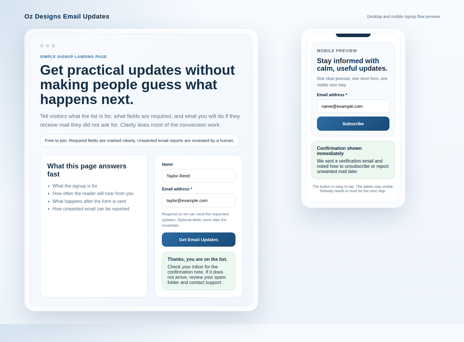
Example confirmation copy:
Thanks, your request is in. We will reply within one business day. If you do not see a message soon, check your spam folder and make sure the email address you entered is correct.
Example for a slower workflow:
We received your request. A team member will review it and send the next step by email. If you need to correct your email address, contact us now so we can update it before the reply goes out.
The screenshot-like layout in the image above works because it keeps the form and the confirmation in the same visual family. Users should not feel as if they were bounced into a different universe after clicking the button.
Privacy and consent microcopy: short, clear, and visitor-friendly
This is the paragraph people often skip, then regret later. Consent wording should be brief enough to read, but specific enough to mean something. The goal is not to bury the form in legal language. The goal is to be transparent.
A good privacy line says:
- what the email will be used for,
- whether future marketing is part of the deal,
- how to opt out, and
- where to read more if the visitor wants details.
The FTC’s CAN-SPAM compliance guide is useful if your form feeds marketing email. Its core message is simple: do not hide the opt-out path, and do not make unsubscribe requests hard to honor. That matches common sense, which is still the best policy tool available on most days.
Privacy microcopy examples:
- Short: We use your email to reply to this request. If you opt in to updates, you can unsubscribe at any time.
- Clearer: We will only contact you about this request unless you choose to receive future updates.
- More explicit: By sending this form, you agree that we can reply by email and keep your details for support records.
If you want a second layer of reassurance, link to your Privacy Policy in plain language. Visitors rarely mind a policy link. They mind a policy that reads like it was assembled from spare parts.
Testing checklist before publishing
A clean form can still fail if the basics are off. Before you publish, test the whole thing on a real phone, a desktop browser, and at least one email inbox you control.
- Mobile layout: Labels stay above the fields, buttons are easy to tap, and text does not collapse into a wall of gray.
- Autofill: Name and email fields work with browser assistance when appropriate. MDN’s autocomplete reference is a good checkpoint for this.
- Error messages: If the email is wrong, the message appears next to the field and says exactly what to fix. NNGroup’s error message guidelines are a solid baseline.
- Required markers: It is obvious which fields are required and which ones are optional. No field should feel like a trick question.
- Spam controls: If you use a honeypot, rate limit, or CAPTCHA, confirm that real users can still submit comfortably.
- Confirmation flow: The success message appears immediately and does not depend on a second page loading perfectly.
- Deliverability basics: Test the reply from a real mailbox and make sure it does not get buried by a vague sender name or broken from-address.
- Tracking and workflow: If form submissions need to land in a team queue or admin dashboard, a lightweight web app generator can help prototype the routing before you commit to custom code.
If the form starts growing into a small operational system with statuses, assignments, and follow-up steps, stop pretending it is “just a form.” That is usually the moment where simple workflow decisions save more time than extra copy ever will.
FAQ: wrong email addresses and unsubscribes
What if someone enters the wrong email?
Show the error before submission when you can, and show a confirmation fallback after submission when you cannot. If the address looks invalid, the form should say so clearly. If it is technically valid but probably wrong, the confirmation screen should tell the user to check the inbox they entered.
A practical confirmation line is: “If you do not see our reply, check the address you entered and look in spam or junk.” That sentence is plain, useful, and less annoying than a mystery.
What if someone unsubscribes?
Respect the request quickly and make the process boring. That is the point. The FTC guidance above is helpful because it reinforces a basic rule: the user should be able to opt out without friction. If the form ever feeds a mailing list, the unsubscribe link should be visible and functional.
If the request form is only for one-time replies, say that. Do not make people wonder whether “request info” quietly means “monthly newsletter forever.”
What if the visitor wants to send a new request later?
That is fine. They can use the form again, or you can point them to the Contact page if the request no longer fits the original intake path. The best forms do not trap people. They give them a clear next step.
Quick template: a ready-to-paste structure for the form sections
If you want a fast starting point, use this structure and adjust only what you need. Keep the wording short. Keep the labels visible. Keep the promise honest.
Download the request info form template (TXT)
Form title: Request Information

Short intro:
Tell us where to send the details. We only use your email to reply to this request.

Fields:
1. Full name *
2. Email address *
3. What you need help with *
4. Company or website (optional)
5. Phone number (optional)

Consent line:
We will use your email to reply to this request. If you choose to receive updates, you can unsubscribe at any time.

Button:
Send my request

Confirmation message:
Thanks. Your request is in. We will reply within one business day.

Fallback note:
If you do not see our reply, check your spam folder and confirm that your email address was entered correctly.
You can also reuse the same structure for a landing page, a support request, or a simple inquiry form. The wording changes a little, but the logic does not.
Bottom line
A good request-info form does not try to impress anyone. It just helps the right people move forward without friction. That means fewer fields, clearer labels, friendlier confirmation copy, and privacy wording that says what it means.
If you want to keep refining it, start small. Compare the form against your Blog resources, review the broader site promise on the home page, and make sure the next step is always obvious. If you want to know how the site is framed overall, the About page is a good place to start. Good forms do not shout. They guide.
Key points to remember:
- Ask only for what you truly need.
- Make required and optional fields easy to tell apart.
- Write confirmation text before you publish the form, not after support starts hearing about it.
- Use short privacy copy that explains consent without sounding stiff.
- Test mobile, autofill, errors, and reply behavior before you launch.