Logos & Web Buttons: A Quick Guide to File Sizes, Loading Speed, and Where to Use Each Format
If your logo or button file is bloated, blurry, or mysteriously ugly on mobile, the browser is not being dramatic. It is reacting to the bytes you gave it.
Most people ask the wrong question first. They ask, “Which format looks best?” when they should ask, “Which format fits this job without wasting load time?” That is the useful question, because a logo in a header, a tiny favicon, and a decorative button in a hero banner do not need the same file treatment. The web is not a print brochure. It punishes bad assumptions in public.
For a plain-English baseline on how image delivery affects the browser, see the guidance on web.dev’s image fundamentals and the MDN reference for the responsive images. Those resources explain the basic mechanics. This article translates that into decisions you can actually use on a site like this one, the same way you would compare options on the services page before you pick a path.
By the end, you should know which format to use for logos, when a button should never be an image at all, how to size exports without turning them into mush, and how to run a quick self-audit before the next upload. If that sounds overly practical, good. That was the idea.
1. Why file size matters for logos and buttons
File size matters because the browser has to fetch every image before it can paint the page. If your logo is 300 KB when it could have been 12 KB, you are not buying quality. You are buying delay. On a homepage, that delay is often most obvious above the fold, where the logo, navigation, and primary call to action all compete for attention at the same time.
There is a second problem. Badly chosen formats do not just load slowly; they also look wrong. A soft, compressed JPG logo can look fuzzy on a high-density display. A PNG exported at absurd dimensions can be crisp and wasteful. A thin-stroked SVG can render beautifully in one place and look weak in another if the original art was not designed for small sizes. The file format is not magic. It only exposes the quality of the source.
Use file size as a proxy for discipline. A lean asset usually means someone made decisions about transparency, dimensions, stroke weight, and export settings. A bloated asset usually means no one did. Browser behavior is boring in that sense, which is exactly why it is useful.
- Page load: oversized logo files add weight to a page that usually needs to load immediately.
- Visual stability: the browser should not spend extra time re-rendering a logo that should have been exported correctly in the first place.
- User trust: blurry marks and muddy buttons make a site feel less cared for, even when the rest of the page is fine.
- SEO and performance: image efficiency contributes to the broader performance picture, which is one of the things search systems and users both notice, however politely they pretend otherwise.
2. PNG vs JPG vs SVG vs WebP: plain-English tradeoffs
There are only four formats you need to care about for this use case, and each one has a narrow job. The trick is not finding the one “best” format. The trick is not using the wrong one and then pretending the result is a design choice.
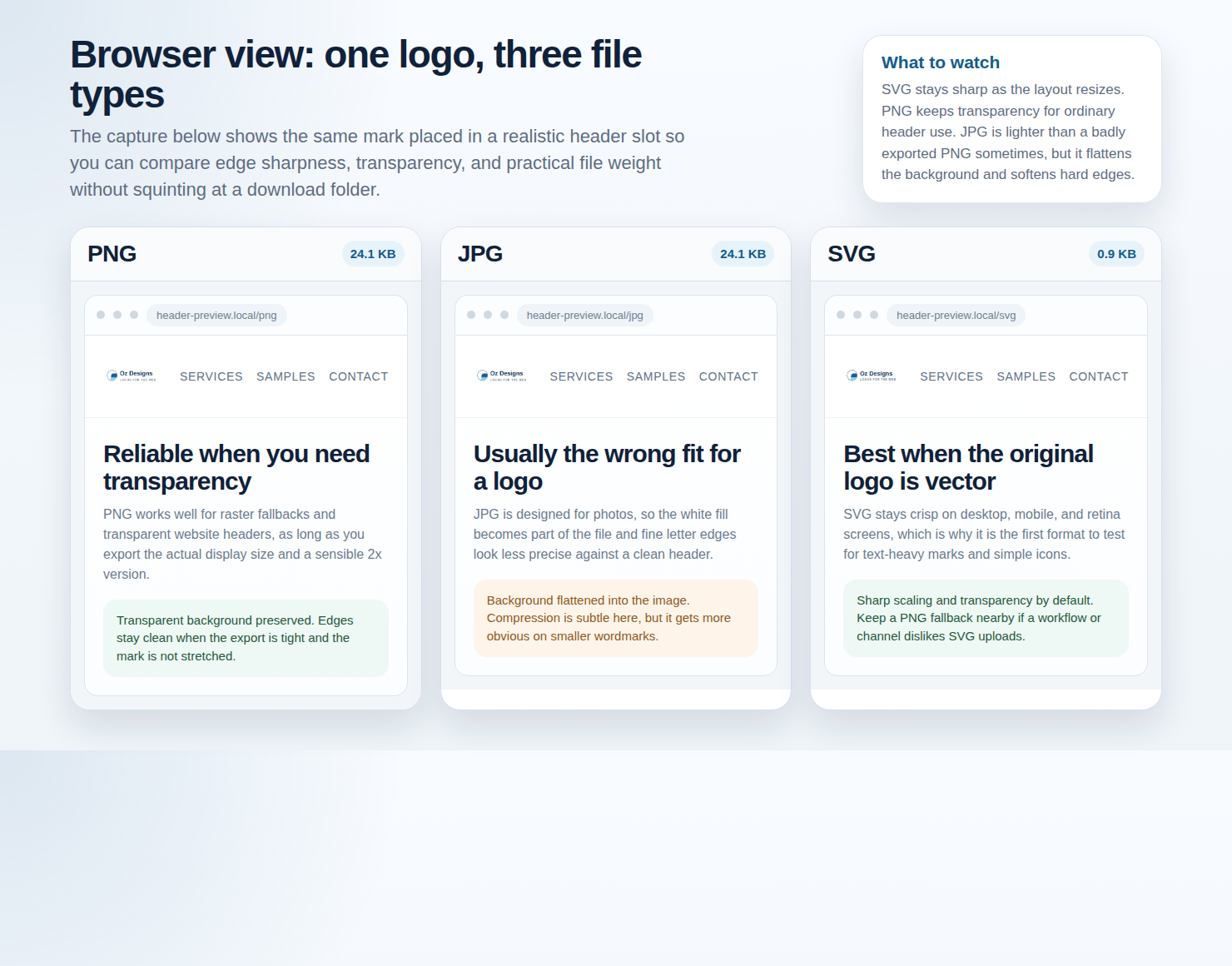
SVG is the cleanest answer for logos and simple icon-style buttons when the artwork is flat and vector-based. MDN’s SVG reference covers the basics: it scales without pixelation because it describes shapes mathematically instead of storing a fixed grid of pixels. That is why SVG is usually the first thing to try for logos.
WebP is the better raster compromise when you need smaller files and, sometimes, transparency. Google’s WebP documentation explains why it can beat PNG and JPG on file size. For web assets that are not clean vectors, it often gives you more room to cut weight without sacrificing obvious quality.
| Format | Best for | Weak spot | Use it when |
|---|---|---|---|
| SVG | Logos, simple icons, flat buttons, marks that must scale cleanly. | Can be overcomplicated if exported badly; not ideal for photos or painterly art. | You want sharp edges at any size and transparent backgrounds by default. |
| PNG | Transparent logos, UI badges, flat graphics that need crisp edges. | Files are heavier than necessary if the art could have been SVG or WebP. | You need exact pixel control and transparency without vector conversion. |
| JPG | Photos, textured illustrations, raster art with no transparency. | No transparency; sharp edges and text can get ugly fast. | The asset is photographic, not logo-like. |
| WebP | Compressed raster assets, some transparent graphics, mixed-image workflows. | Not as elegant as SVG for logos that should stay perfectly sharp at any size. | You need a smaller raster file and SVG is not the right source format. |
That is the short version. SVG usually wins for logos. PNG is the safety net when transparency matters and the art is flat. JPG is for photos, not marks. WebP is the practical compression option when the asset stays raster. The browser does not care about your personal format preference, which is rude but useful.
3. How to choose based on use case
The right format depends on where the asset lives. A logo in the header has a different job from a favicon, and a decorative button in a hero banner is not the same thing as a real clickable control. Mixing those up is how people end up with a site full of oversized screenshots of buttons, which is a sentence I wish I could unwrite.
Header logo
Best default: SVG. It keeps sharp edges on retina displays, scales cleanly, and usually stays small. If the source logo has gradients, multiple color transitions, or photo-like treatment, use WebP or PNG only after you have ruled out SVG.
Footer logo
Best default: SVG or a small PNG if the footer background or logo treatment creates contrast issues. Footer logos are often smaller and less visible than the header version, so they should stay simple. If the mark gets too detailed, the footer becomes a readability test instead of a brand asset.
Favicon
Best default: simplified SVG or a tightly sized PNG in the common favicon sizes. The browser tab is a tiny space. Thin strokes, complex wording, and clever details all get punished there. Keep the mark brutally simple.
Hero button
Best default: if it is a real CTA, use HTML and CSS, not an image. If the button is part of a screenshot, banner, or locked artwork, use SVG for flat shapes or PNG/WebP for raster artwork. Do not turn an interactive control into an image just because the export menu was already open. That is not a design system.
In-content buttons
Best default: HTML/CSS for actual controls; PNG or SVG only when the button is part of a visual illustration, mockup, or branded graphic. The more your content depends on text inside the image, the more likely you are baking in readability problems for no good reason.
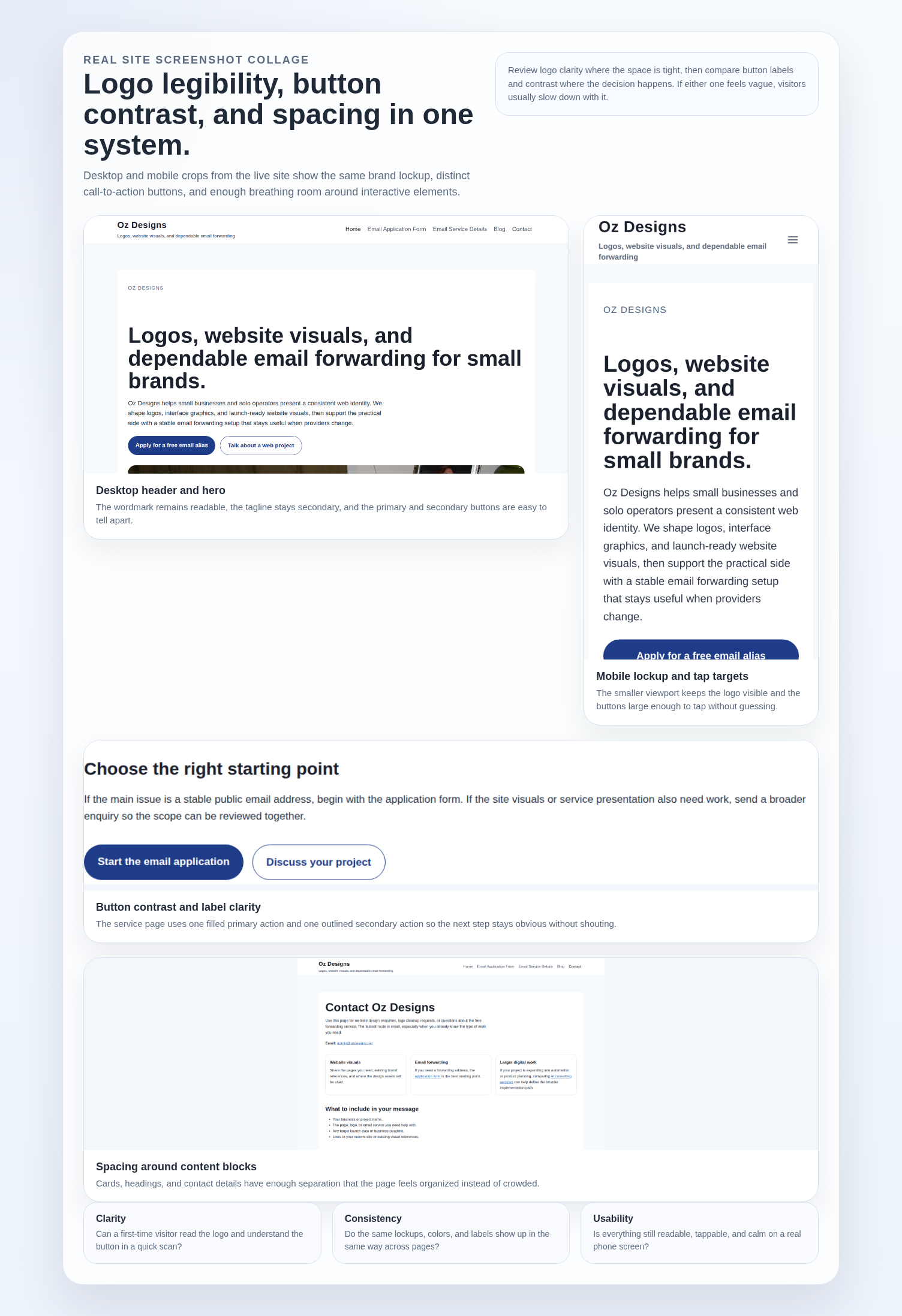
If the site needs help with visual hierarchy, spacing, or logo/button treatment, the services page is the obvious place to check. If you are just trying to compare how the current site presents itself overall, the homepage should tell you whether the visual system is coherent or merely present.
4. Sizing rules of thumb: design for the largest display, then scale down safely
The clean rule is simple: export for the largest size the asset will visibly occupy, then scale down. Do not scale up a tiny file and call it responsive. That is how logos go soft and buttons go muddy. The browser can resize, but it cannot invent sharp detail you never gave it.
For raster files, keep a higher-resolution master and deliver a smaller display version. If a logo is shown at 160 by 48 pixels in the header, export a 320 by 96 pixel raster version for high-density displays, or use SVG so you do not have to guess. MDN’s image guidance on the responsive images is useful here because responsive delivery is not a decorative extra. It is the whole game.
- Do not upscale raster logos. A 120 by 40 pixel file stretched to 240 by 80 will look like it was rescued from a low-resolution hallway camera.
- Use SVG when the art allows it. A well-made SVG removes the “largest display” guessing game almost entirely.
- Keep transparent padding under control. Too much empty space creates weird alignment problems when the logo is placed in a tight header.
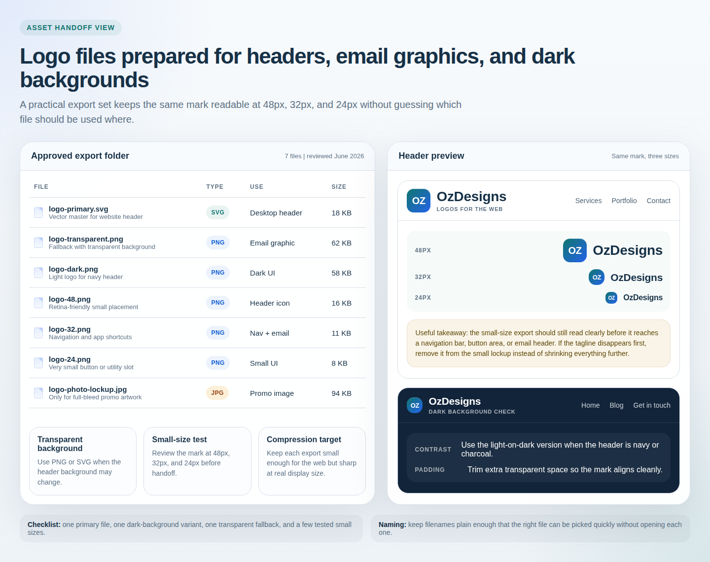
- Test at the actual use size. A logo that looks perfect in a design app can still fail once the browser renders it at 24 or 32 pixels high.
- Use srcset for raster assets when needed. If the asset must be raster, provide more than one size instead of making one file do everything badly.
For a quick visual reminder of how exports behave at different sizes, the screenshot of the export folder and header preview is more honest than a long meeting. It shows the file names, the variants, and the actual result in the browser.
5. Compression checklist before you upload
Compression is not a moral virtue. It is a cleanup step. Run the checklist below before the file lands in the media library and before someone on the team starts defending a bad export as “brand consistency.”
| Check | What to confirm | Why it matters |
|---|---|---|
| Dimensions | The file is not larger than the largest intended display size without a reason. | Oversized files waste bandwidth and slow the page. |
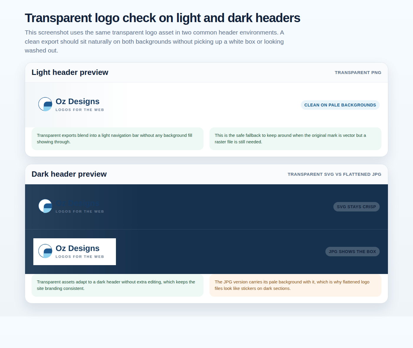
| Transparency | The background stays clean on light and dark surfaces. | A visible box around a logo looks amateurish immediately. |
| Edges and text | Lettering, strokes, and corners remain crisp after export. | Soft edges make a logo or button label look cheap. |
| Banding | Gradients do not step awkwardly or show posterization. | Banding is a sign that compression or source quality is too aggressive. |
| Background contrast | The asset still works on the actual site background, not just on white. | A logo that disappears on one background is a layout problem waiting to happen. |
| Metadata | Unnecessary embedded junk has been stripped out where possible. | Every extra byte is still a byte. |
For practical tools, use a proper optimizer, then check the output at the exact size it will appear on the page. If the icon is transparent, test it on both light and dark backgrounds. If the file contains text, zoom in and check whether the letters still look like letters. Simple enough. Annoying enough that people skip it.
6. Common mistakes that make logos blurry or buttons muddy
The failures here are predictable. That is the good news. The bad news is that people keep repeating them because the result looks “fine” in a folder preview and only falls apart once it hits the page.
- Using JPG for logos. JPG compression is happy to smudge the edges of letters and shapes. It is doing its job. Your job is not to ask it to do the wrong one.
- Using a raster file that is too small. If a logo needs to be twice the size on a Retina screen and you exported only one tiny version, it will blur when scaled.
- Ignoring transparency. A background box around a logo or button is visible in exactly the way you do not want.
- Overcompressing flat art. Flat graphics need a light touch. Smash them too hard and the edges turn to noise.
- Letting thin strokes survive unchallenged. A delicate mark can look elegant in a design app and weak in a 24-pixel header. Edit the source art, not just the export setting.
- Forgetting dark mode or alternate backgrounds. A logo that only works on white is not finished; it is merely convenient.
The fix is usually not mystical. It is almost always a better source file, a cleaner export, or a different format. Sometimes the answer is simply “use SVG and stop making this harder than it needs to be.” A rare act of kindness toward the browser.
7. Where to place images on the page for best performance
Placement matters because not every image deserves the same priority. The browser should focus on the content the visitor will actually see first. That means your logo, main hero visual, and any critical brand signal should be lightweight and ready fast. Decorative images below the fold can wait their turn.
Do not lazy-load the logo if the logo is part of the first visible screen. That would be clever in the same way it is clever to lock the front door from the inside. Decorative support images lower on the page are better candidates for lazy loading. MDN’s image documentation covers the mechanics, and the point is simple: critical assets should appear quickly; noncritical assets should wait.
- Above the fold: keep the logo, main CTA, and any essential brand asset tiny and efficient.
- Near the fold: use smaller supportive graphics that do not block the first paint.
- Below the fold: lazy-load decorative or explanatory images that do not affect the first impression.
- Critical logo variants: cache them well and avoid unnecessarily complicated export pipelines.
If you need a place to talk through the page structure itself, use the contact page. If you already know you need a form-based next step, the email application form is the direct path. Either way, do not hide the important stuff behind a file that takes too long to arrive.
8. Quick self-audit: 5 questions to decide what to change
Here is the part where you stop guessing and inspect the actual assets. Ask these five questions before you upload the next logo or button graphic:
- Is this really a vector job? If the asset is flat, simple, and branded, SVG is probably the first thing to try.
- Does the file need transparency? If yes, PNG, WebP, or SVG are the candidates. JPG is not.
- Am I exporting at the right size? If the current file is much larger than the visible slot, trim it.
- Does it still look sharp at the smallest real display size? Check the hardest case, not the nicest mockup.
- Have I checked the background it will actually sit on? White is not the only background in the universe, although it often behaves like it is.
If the answers keep changing from one person to the next, write the rules down somewhere visible. A shared checklist is better than tribal memory. And yes, a web app generator can be a practical way to turn that checklist into a simple approval or handoff flow instead of another spreadsheet that nobody opens twice.
For related design guidance, keep the blog in your back pocket. It is the place to look when the issue is not just one logo file but the whole pattern of how your site presents itself.
9. A simple decision tree you can reuse
Use this every time you are not sure which format to choose:
- Is the asset a real logo or icon made of flat shapes? Use SVG first.
- Does it need transparency but cannot be vector? Use PNG or WebP, then pick the lighter file that still looks clean.
- Is it a photo, textured illustration, or raster art? Use JPG or WebP, with WebP as the first thing to test if browser support and workflow allow it.
- Is it a true interactive button? Use HTML and CSS, not an image file.
- Is it only a favicon or tiny tab icon? Simplify hard. SVG if the mark survives; otherwise a tightly sized PNG.
- Does the image appear above the fold? Keep it small, essential, and unambiguous.
- Does the image live below the fold? Optimize it aggressively and lazy-load it when it is safe to do so.
Short version: SVG for flat logos and icons. PNG for transparent raster artwork. JPG for photos. WebP when you want a smaller raster file. HTML/CSS for real buttons. That is the whole decision tree. Everything else is mostly people talking themselves into unnecessary complexity.
Final take: use the simplest format that still protects clarity
The point is not to collect formats. The point is to preserve sharpness without inflating the page. Choose SVG when the logo can be vector. Choose PNG or WebP when you need a transparent raster asset. Keep JPG for photos and textured artwork. Avoid image-based buttons unless the button is part of a mockup, banner, or controlled graphic. Then test the asset where it will actually live, not where it looks flattering in a folder.
If you want the same rule in one sentence, here it is: design for the largest real display, export cleanly, and stop using the wrong format because it was already in the export menu.
For the rest of the site journey, the homepage gives the current brand context, the services page covers the practical design side, and the contact page or email application form is where to go if you need help turning the checklist into an actual workflow.
- SVG is the default answer for logos and simple UI marks.
- PNG is the fallback when transparency matters and vector is not an option.
- JPG belongs to photos, not logos.
- WebP is a strong raster compression option when SVG is off the table.
- Real buttons should usually be HTML/CSS, not image files.