Web Button Design for 2026: Size, Contrast, Copy, and Click-Flow (Checklist)
Buttons are not decoration. They are the point where a user decides whether your page is worth the next click. If the label is vague, the contrast is weak, or the next screen feels like a guess, the button is doing the opposite of its job.
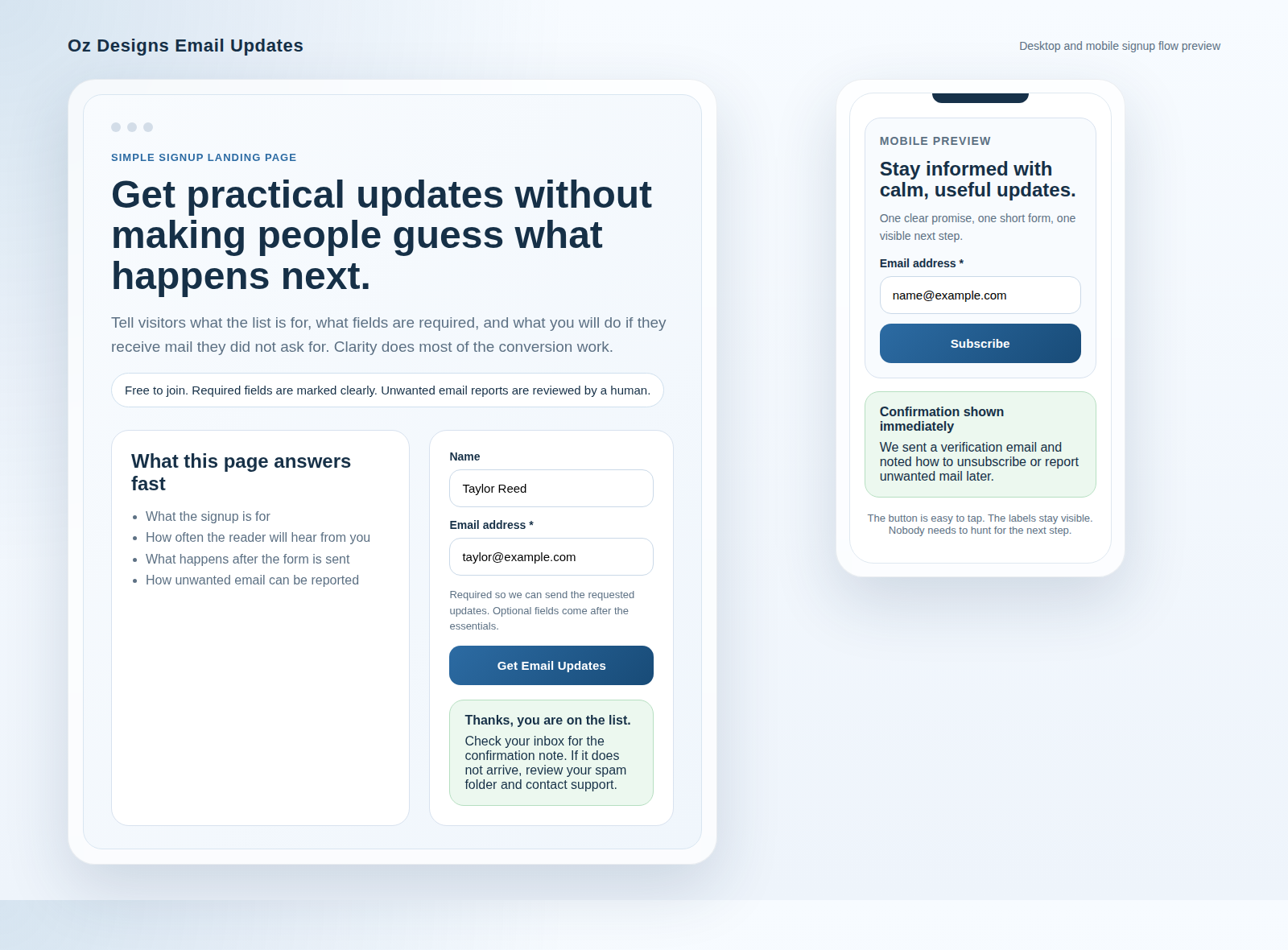
If you want a broader layout pass before polishing button states, start with the page structure on the home page, then work through the offer and conversion surfaces on services and contact. For more workflow notes, the blog index is the right place to keep the audit moving.
Why buttons fail
Most button problems are boring in exactly the way that costs money:
- Low contrast: the label blends into the background, especially in hover or disabled states.
- Unclear labels: “Submit” and “Click here” tell users almost nothing about the outcome.
- Inconsistent placement: the main action shows up too late, or competes with navigation and secondary links.
- No visible focus state: keyboard users cannot tell where they are, which is a design failure and a navigation failure.
- The click leads to a surprise: the next screen does not confirm context, so the user has to re-orient after the click.
If the label does not say what happens, users will guess. Guesses are expensive.
Button hierarchy: primary, secondary, and link-style
Use the style to match the intent. If everything looks primary, nothing is primary.
| Style | Use it for | Example |
|---|---|---|
| Primary button | The single main action in that section | Get a free quote |
| Secondary button | A meaningful alternative, but not the default | View pricing options |
| Link-style button | Lightweight navigation or lower-commitment actions | Read the service details |
The rule is simple: one primary per section. If two buttons both look urgent, the page has already started negotiating with itself.
That rule applies on service pages, product pages, and contact flows alike. If you need a button to carry the main conversion path, make sure it is the easiest thing to see and the easiest thing to hit.
Sizing and spacing: height, padding, and touch targets
Buttons should feel steady across the site. Pick a consistent height, then keep it consistent. Small desktop-only buttons are a tax on mobile users, and mobile users are most of your accidental-test department.
- Use consistent height: mixed heights make a page feel unfinished.
- Give the label room: padding is not decorative; it is part of the target.
- Leave breathing space: crowded buttons invite mis-taps and slow scanning.
- Stack when space is tight: on narrow screens, vertical rhythm usually works better than a compressed row.
- Avoid icon-only buttons: if an icon is necessary, pair it with text that explains the action.
For touch usability, assume the user is tapping with one thumb and no patience. If the target feels fiddly, it is too small.
Contrast and accessibility basics
Readable contrast is table stakes. But accessibility is not just color. It includes focus states, keyboard navigation, and sane element choices.
- Readable text: the default state needs enough contrast to scan quickly.
- Visible focus state: keyboard users need a clear ring, outline, or equivalent indicator.
- Hover is not focus: both states should be designed intentionally.
- Keyboard order should match visual order: if the tab path is confusing, the layout is confusing.
- Use semantic elements: use
<button>for actions and<a>for navigation rather than role-hacking your way through the markup.
If you want the underlying guidance from the people who write this stuff for a living, start with the W3C accessibility tips for designing and the W3C image tips. They are useful because they are annoyingly specific, which is usually a good sign.
For teams that prefer practical implementation notes, MDN’s keyboard accessibility guidance is a solid reference point for keeping navigation predictable.
Copy that earns clicks
The best button copy uses a simple pattern: verb + outcome. The user should know what happens next without decoding the page like a small crime scene.
- Get a free quote
- Request access
- Start your project
- Email me
- See pricing options
Avoid labels that hide the result. “Submit” can be fine inside a form if the surrounding context is obvious, but it is usually weaker than a label that names the outcome.
If the action opens a contact path, say so. If it starts a form, say that. If it moves the reader to a service detail, say that too. Matching label to intent matters more than sounding clever.
For example, a contact prompt on the contact page should feel different from a request button on a service page. Same site, different intent, different label.
Click-flow rules: what happens immediately after the click
The click is not the finish line. It is the moment when the interface must prove it understood the request.
- Confirm context: the next screen should clearly show that the right action happened.
- Show the next step: if there is a form, say what fields are required and what happens after submission.
- Avoid dead ends: users should not have to ask “Did that work?”
- Keep language consistent: the button text and the destination should agree.
- Reduce friction: do not add extra interpretation work after the click.
A good click-flow feels boring in the right way. The user clicks, sees confirmation, and immediately knows what to do next. No mystery. No scavenger hunt.
Performance considerations
Buttons do not need heavy assets to work. They need clean state handling.
- Use simple HTML and CSS: hover, focus, active, and disabled states should be lightweight.
- Avoid heavy icon libraries for basic buttons: they add weight and rarely add clarity.
- Keep transitions subtle: short, clean motion is enough.
- Do not animate layout shifts: buttons should feel stable, not jumpy.
- Make disabled state obvious: if it cannot be clicked, it should look that way.
If you are using the browser’s native behavior well, you are already ahead of a surprising amount of modern UI.
Quick 15-minute checklist
- Is there exactly one primary action in each section?
- Does the label say what happens next?
- Is the default contrast readable in normal light?
- Can you see focus clearly when tabbing through the page?
- Are button sizes consistent across the site?
- Is the touch target easy to hit on mobile?
- Does the button sit near the reason to click?
- Does the next screen confirm the click and show the next step?
If a button fails two of these checks, it probably deserves another draft, not another gradient.
Mini rewrites: weak labels into stronger options
| Weak label | Stronger label | Why it is better |
|---|---|---|
| Submit | Send my request | Names the outcome instead of hiding it in form language. |
| Click here | Email me | States the action and reduces ambiguity. |
| Learn more | See pricing options | Explains what the user will see next. |
| Get started | Start your quote | Connects the action to the user’s goal. |
| Contact | Contact sales | Adds context so the reader knows who they are contacting. |
Those rewrites are small, but they do real work. They tell the reader what the button does, not just that a button exists.
Use the checklist before publishing
Before a page goes live, look at the buttons in order: hierarchy, size, contrast, focus, copy, and click-flow. If those six parts hold together, the rest of the page usually behaves better too. If they do not, the page is broadcasting uncertainty.
That is why buttons are part of the operating system, not the decoration. Design them like they matter, because they do.