Designing Eye-Catching Web Buttons: Best Practices
Designing Eye-Catching Web Buttons: Best Practices
Most “button” problems aren’t about buttons. They’re about clarity, contrast, and whether the page actually earns the click. If your CTAs feel ignored, you’re not stuck—you just need a repeatable set of checks that rule out the boring failure modes first.
You’re probably wondering: Why do my buttons blend in? What text should I use? Where should buttons go? and How do I test without guessing?
Design systems and usability guidance consistently show that legibility, visual hierarchy, and feedback reduce user friction. According to Nielsen Norman Group, good interface design depends on visible affordances and reducing ambiguity in user actions (see Nielsen Norman Group on UX design principles) and WCAG highlights contrast and text legibility as essential for accessibility (WCAG 2.1 contrast guidance). The result: when buttons are readable and predictable, clicks follow.
In this guide, Felix Rowan’s troubleshooting-style checklist walks through color/contrast, text and font choices, placement strategies, and testing/optimization—so you can turn “nice design” into buttons people actually use.
Importance of web buttons
A button is a promise: “If you do this, something will happen—and it will make sense.” When that promise breaks, users either hesitate or bounce.
- Buttons create next steps: navigation is slower; CTAs move people from curiosity to action.
- Buttons reduce decision fatigue: one clear primary action beats five competing “maybe” options.
- Buttons carry meaning: text like “Request info” signals intent; vague labels like “Go” don’t.
Color and contrast considerations
Color makes a button look clickable. Contrast makes it readable. Fix the hierarchy before you “beautify” anything.
1) Use contrast to survive real lighting and real screens
Pick a background color for the button that stands out from the surrounding page elements. Then verify the text contrast and the button’s overall visibility. If your site uses light backgrounds, test dark button variants (and vice versa).
Rule of thumb: if the button looks strong on your monitor but disappears on mobile, your contrast relationship is wrong—not your imagination.
2) Keep a “primary” and a “secondary” button
Instead of multiple similarly styled buttons (all pretending to be equally important), use:
- Primary: one CTA color, one visual weight.
- Secondary: a lower-emphasis style for less urgent actions.
This prevents accidental competition between actions.
3) Watch contrast for disabled and hover states
Disabled buttons shouldn’t be “invisible.” They should clearly communicate “not available” while still meeting basic legibility expectations.
4) Don’t rely on color alone
Accessibility guidance is clear: users can’t interpret meaning from color alone. Ensure focus rings, hover effects, and text labels provide the necessary signals (WCAG non-text contrast guidance).
Text and font choices
A button’s label is the main event. Design is the packaging; the words are the product.
1) Make the action specific
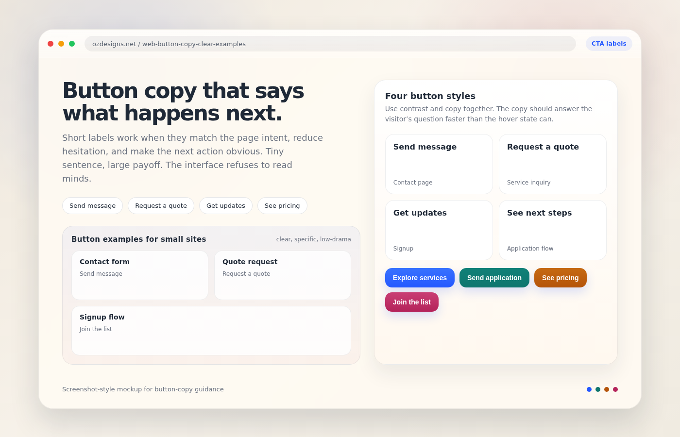
- Better: “Request a quote” / “Get email support” / “Send inquiry”
- Worse: “Submit” / “Go” / “Click here”
Specific text reduces uncertainty. Uncertainty kills clicks.
2) Match the promise to the next page or modal
If clicking the button opens a form, labels should match that reality (“Request info” beats “Download”). If it triggers something else (e.g., scheduling), don’t disguise it.
3) Use a readable font size and weight
Make the label readable at typical button size—especially on small mobile screens. If your typography system scales nicely, buttons should inherit that logic.
Practical check: squint test. If you can’t read it from a few feet away on a phone, your users can’t either.
4) Add microcopy only when it removes anxiety
If you need reassurance, keep it short and directly relevant. Examples:
- “Free service”
- “No spam—unsubscribe anytime”
- “Takes ~2 minutes”
Don’t add paragraphs. Buttons aren’t essays.
Placement strategies
Placement is a logic puzzle: when a user is ready to act, the button should be where their attention already is.
1) Put the CTA near the decision moment
Common decision moments:
- After explaining a benefit
- Near pricing or a “how it works” step
- At the end of a form-related section
If the CTA comes too early, you’re asking people to commit before they understand. Too late, you’re asking them to scroll back.
2) Don’t split focus with competing links
In the vicinity of your primary button, reduce distractions. If your page is packed with similar-looking links, your CTA becomes one more element in the crowd.
3) Use repeated CTAs for long pages (sparingly)
Long guides benefit from:
- A CTA after the core explanation
- Optional “sticky” CTAs only when they don’t obstruct reading
- One final CTA near the conclusion
4) Ensure keyboard focus and visible states
Buttons must look interactive for both mouse and keyboard users. Confirm focus styles are visible, not clipped, and not replaced by outline: none.
Testing and optimizing buttons
Stop “red button, blue button” experiments that ignore measurement. Test changes that connect to user behavior: visibility, clarity, and action fit.
1) Use a simple success metric
Pick one primary metric per button:
- Button click-through rate (CTR)
- Form start rate
- Completion rate (submit/checkout)
2) Run tests in controlled batches
To avoid turning your results into nonsense, change one major variable per test cycle:
- Test label before testing color.
- Test contrast before testing font.
- Test placement before changing page layout.
3) Create a checklist before you launch
Here’s a practical checklist you can reuse:
| Check | What to confirm |
|---|---|
| Contrast | Button is readable against its background in both default and hover states |
| Label clarity | Text matches the next step (form, download, contact, etc.) |
| Hierarchy | Only one primary CTA has the highest visual emphasis |
| Placement | CTA is near the benefit/decision moment, not after the user already left |
| Feedback | Hover/focus/active states communicate interactivity |
4) Don’t ignore analytics for failure reasons
If clicks are low, check whether users can find the CTA:
- Scroll depth and attention patterns
- Mobile vs desktop differences
- Traffic source mismatch (people arriving for one reason but seeing a different CTA)
If clicks are decent but conversions are low, the issue is often the next step friction (form length, confusing fields, unexpected requirements). A button can be perfect and still fail because the follow-through is broken.
Quick examples you can copy
Use these as starting points, then tailor to your real next step:
- Consultation: “Get a free call”
- Lead capture: “Request project details”
- Newsletter: “Subscribe for updates” (pair with a trust microcopy)
- Service inquiry: “Send an inquiry”
If the button is on a page that explains logos and web design, readers may also benefit from a broader service overview on our services.
Conclusion
Eye-catching isn’t a color choice. It’s a system: contrast that survives real screens, text that removes ambiguity, placement that matches the decision moment, and testing that connects to measurable outcomes.
If you want a neutral next step, start with this diagnostic: pick your primary CTA, then rewrite its label to name the exact next action. Only after that, validate contrast and focus states. When the “easy to click” and “easy to understand” problems are solved, you’ll know what’s left—and you won’t waste weeks redesigning the wrong thing.
Further reading: MDN on form validation and usability and WCAG 2.1 overview.