Free PoP3 Email Service: What You’ll Need to Provide (and Why It Matters)
Email application guide
Free PoP3 Email Service: What You’ll Need to Provide (and Why It Matters)
If a form says “free” and then falls apart because someone typed one field wrong, the problem is not mysterious. The form asked for precision and got guesswork. The internet has never rewarded guesswork, and this page is no exception.
People usually arrive with the same questions, even if they phrase them differently: What do I actually need to enter? Why is the email address such a big deal? What happens behind the scenes after I submit? And what do I do if the thing does not work the first time, which, frankly, is always a possibility worth respecting? Those are the real questions, not the decorative ones.
Two boring references cover the core mechanics here. MDN’s email input reference explains how browsers can catch obvious mistakes before they spread, and the W3C’s form label guidance explains why visible labels matter more than clever placeholder text. That is the entire game in one sentence: make the form legible, make the address correct, and do not hide the important parts behind a shrug.
If you want the shorter version of the service itself, the Email Application Form page is the direct path. If you want the bare minimum that has to be true for the setup to work, the Required Email Application Form page is the blunt version. This article is the practical version: what to provide, why it matters, where people usually break the process, and how to avoid becoming another support ticket with a typo attached.
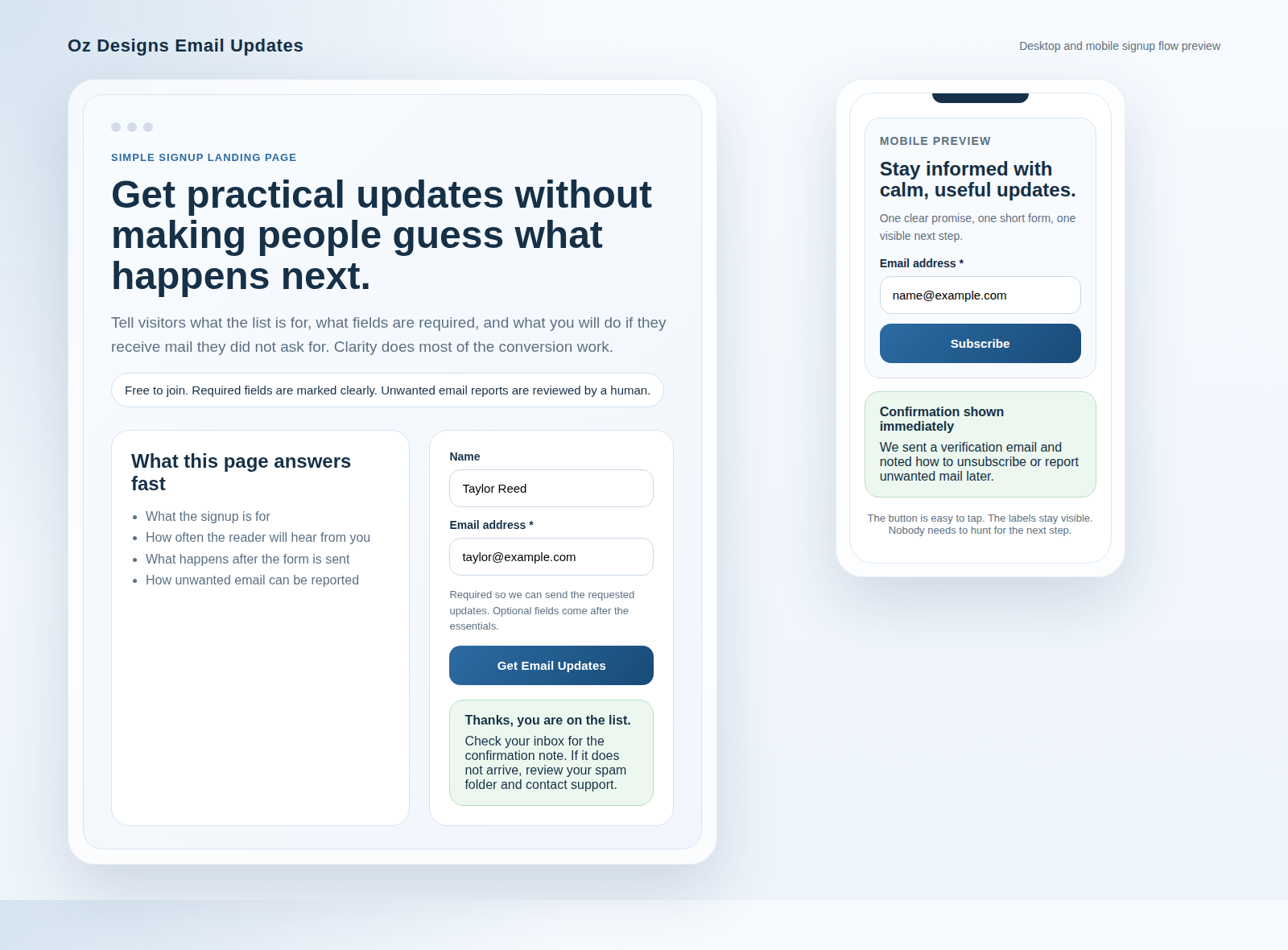
What this free PoP3 service is actually designed to do
The service is simple on purpose. It is meant to take a public-facing request, route it to the right destination, and keep the visible email address stable even if the backend path changes later. That is the useful part. The visible address stays familiar for the user, while the routing can change behind the curtain without forcing everyone to learn a new address every time a server does its little dance.
That stability matters because users do not care about your backend architecture unless it fails. They care about whether the address they gave you still works next week, and whether the reply lands where they expected. A free PoP3 service is useful precisely because it reduces address churn and gives the visitor a stable contact point. When the setup is done well, nobody sees the machinery. They just see mail arriving where it should.
If you want to sanity-check the broader site context before you fill anything out, the home page lays out the current service framing. That is not decorative navigation. It is the plain explanation of what this site is for, which is usually more valuable than whatever the last enthusiastic form builder claimed in a tooltip.
| What the service handles | What it does not magically solve |
|---|---|
| Routing mail to the correct current destination. | Bad input, broken addresses, or a typo that sends the request into a ditch. |
| Keeping the public-facing address consistent. | A user who gives the wrong email and then wonders why no reply arrives. |
| Giving you a stable place to reply from and keep track of requests. | Every spam problem on earth. The web would be nicer if that were true, but it is not. |
If the workflow ever grows into routing, queueing, or status tracking, the next problem is no longer just a form. At that point, a neutral resource like AI consulting services can help teams figure out where automation fits and where a human process is still the safer choice. That is the sane question. Automate the right step, not the loudest one.
The required details checklist
The fastest way to break an application is to treat every field as optional in your head and then act surprised when the form refuses to cooperate. The application is only as good as the information supplied, and some fields matter much more than others. Start with the obvious pieces, then check whether anything else is genuinely necessary.
Here is the practical checklist I would use before submitting the form:
- Your name. Use the name you want associated with the request, not a joke nickname you may later regret when the reply lands in a shared inbox.
- Your correct email address. This is the main delivery point. If it is wrong, the rest of the form becomes a very elaborate waste of everyone’s time.
- Any required confirmation or consent field. If the form asks you to accept a condition, read it. Yes, I know. Reading is inconvenient. It still works better than guessing.
- Any supporting detail the form specifically asks for. If there is a reason field, a note field, or a routing choice, give the exact answer requested instead of a creative reinterpretation.
- Optional extras only when they help the reply. Company name, website, or a short note can help in some cases, but they should not be invented as substitutes for missing required details.
That list sounds obvious because it is obvious. Yet obvious is where forms fail most often. People skim. They assume. They fill in something close enough. Then the form breaks or the reply goes to the wrong place and everybody starts hunting for blame. Usually the problem was sitting in the first field, smiling.
There is a second reason the checklist matters: the service can only route a request if the inputs match the format it expects. MDN’s documentation on email input validation explains why browsers are good at catching certain obvious mistakes, but not all of them. A valid-looking address can still be the wrong address. The browser can stop nonsense. It cannot stop human carelessness. That is still your job.
If you want the field-by-field public version of the same idea, the Required Email Application Form page exists for exactly that purpose. It is the short list. This article is the longer version, which means it is more useful and slightly more annoying. That tends to be how accuracy works.
Why the correct email address is the #1 success factor
The email address is not a decorative field. It is the destination. If it is wrong, the application can be perfectly formatted and still fail in the only way that matters: nobody receives the result. That is why this field deserves more attention than the others combined.
Here is what goes wrong when the address is incorrect:
- The reply goes to someone else, or nowhere, and the user thinks the form is broken.
- The service may create a record that cannot be completed because the confirmation mail never lands.
- Support ends up dealing with a problem that began as a typo and ended as a mystery.
- The user repeats the submission, which adds duplicate records and more confusion.
There is nothing theatrical about this. A missing character, a wrong domain, or a typo in the local part is enough to derail the process. The annoying part is that the failure can look invisible until the reply never appears. The user assumes the system failed. The system assumes the address was wrong. Both can be true, which is how bureaucracy gets a pulse.
W3C’s guidance on clear form labels matters here because a correct address is easier to enter when the label is visible and the field purpose is unambiguous. If a user has to infer what the box means, they will inevitably do it badly. That is not a moral failure. It is a design failure.
| Common address mistake | Why it fails | What to do instead |
|---|---|---|
| Missing character in the local part | The mailbox may not exist, or the reply may be undeliverable. | Re-type the whole address slowly. Do not trust memory for something that must be exact. |
| Wrong domain | The message goes to the wrong provider or not at all. | Check the domain part character for character before submitting. |
| Extra space at the beginning or end | The form may reject the input or store it in a useless format. | Paste carefully and inspect the full line before you click submit. |
| Using an old address you no longer check | The reply may technically arrive, but nobody sees it. | Use the inbox you still open today, not the one from three devices ago. |
The practical rule is simple: if the email address is not something you could read aloud and have another person type correctly on the first try, it is probably not ready to submit. That sounds harsh. It is just mathematics in a trench coat.
How auto-redirection works in plain English
Auto-redirection is the part people want to overcomplicate because it sounds technical. It is not mysterious. Think of it as a mail-forwarding layer that keeps the visible address stable while the destination behind it can change. The user sees one thing. The routing layer handles the rest. That is the whole trick.
What changes behind the scenes is the destination. What stays stable is the address the user was given and the expectation that the reply will still arrive there. This matters when a server changes, a hosting arrangement shifts, or the current mailbox needs to point somewhere else without forcing the public address to change every time.
In practical terms, the visitor should not need to understand the routing map. They only need to know that the correct address was supplied and that the service can keep mail pointed at the right place. If you want the longer service explanation in a tighter format, the Email Application Form and the home page give the public-facing version of that promise.
What users need to know is less glamorous but more important:
- The service depends on the address being typed correctly.
- The redirection does not rescue a bad recipient address.
- Changes behind the scenes should not force the public address to change.
- Replies may be routed differently over time, but the user should not have to learn a new contact identity every week like they are playing telephone with infrastructure.
That is why the email field is so critical. Auto-redirection can keep the path flexible, but it cannot compensate for a typo in the destination you entered. The system can move mail. It cannot read your mind. A pity, perhaps, but still true.
Security expectations: what the service can protect against, and what it cannot
The sane way to talk about security is to be precise. The service can help reduce some problems, but it cannot turn bad input into good input or make risky habits disappear. That would be a fairy tale, and fairy tales are not a security model.
What the service can help with:
- Keeping the public email address stable even if the backend path changes.
- Filtering or blocking obvious unwanted messages when a problem is reported with enough detail to investigate.
- Providing a predictable place for replies so users are not guessing where their request went.
What you still need to do:
- Enter the correct email address.
- Use an inbox you actually check.
- Read the confirmation message before assuming the request worked.
- Use basic hygiene: do not forward suspicious attachments blindly, do not reuse an address you abandoned years ago, and do not treat every delivery problem like a conspiracy.
If the form feeds any future marketing or opt-in message stream, the FTC’s CAN-SPAM compliance guide is the right external reminder that unsubscribe paths should be real, visible, and easy to use. That is not fancy compliance theater. It is the minimum useful behavior. The visitor should not need a map and a flashlight to stop receiving mail they no longer want.
For a broader reminder about suspicious messages, the FTC’s phishing scam guidance is also useful. It does not solve every problem, but it does keep people from clicking the wrong thing while they are trying to fix a right one. A useful skill, that.
Security expectations should be framed as boundaries, not promises. The service can reduce friction and protect the route. It cannot make a bad address good, and it cannot make a careless submission correct after the fact. That is why the form needs to be clear before it is submitted, not after someone starts hunting through mail logs with a bad mood and a deadline.
Common mistakes to avoid
This section exists because people love repeating the same mistakes and then calling the result a “setup issue”. No. Most of the time it is just a typo, a skipped field, or a form that was not read carefully enough.
| Mistake | Why it breaks the process | Simple fix |
|---|---|---|
| Typing the wrong email address | The reply cannot reach the intended inbox. | Slow down and re-check the address before submitting. |
| Using the wrong domain | The recipient is effectively a different mailbox. | Read the domain out loud if necessary. If it sounds wrong, it probably is. |
| Leaving a required field blank | The form may reject the submission or accept incomplete data. | Look for required markers and complete them in order. |
| Mixing formats or inconsistent spacing | Some systems store odd formatting badly or reject it outright. | Type cleanly, without stray spaces or weird punctuation. |
| Using an inbox you no longer monitor | The setup may work, but the user never sees the reply. | Use the address you actually check, not the one you remember fondly. |
| Rushing past the confirmation text | You miss the instructions for what to do if something fails. | Read the confirmation before closing the tab. |
Need another baseline? NNGroup’s general guidance on web form usability is still correct in the boring way the best advice usually is: keep things visible, reduce confusion, and stop making users guess. It is hard to argue with because it is not trying to be clever. Forms should not be a puzzle box with a submit button on the lid.
A simple way to avoid mistakes is to read the form like someone else wrote it. That sounds strange, but it works. Users are better at spotting hidden assumptions when they stop assuming they are the hero of the interface. This is also why the page should keep the label, the field, and the instruction close together. Distance breeds error. The browser is not to blame for that one.
Before you submit: the 60-second review checklist
If you do one useful thing before hitting submit, make it this. A short review is the cheapest insurance you will ever get. It is also the least glamorous, which is exactly why people skip it and then ask support to interpret a typo after the fact.
- Read the email address again. Not the idea of the address. The actual characters.
- Confirm every required field is complete. Missing one is enough to cause a failure.
- Check the domain name. This is where most address mistakes hide.
- Look for extra spaces or odd punctuation. These are small, irritating, and often fatal.
- Make sure you used the inbox you actually monitor. A correct address you never read is still a bad outcome.
- Scan the confirmation text. It usually tells you what happens next and what to do if nothing arrives.
If the application is part of a larger site workflow, the supporting articles in the blog often explain adjacent problems in the same blunt style. That matters because forms rarely fail alone. They fail in context, inside a larger set of pages, expectations, and support steps.
If you prefer a simpler mental model, this is it: check the address, check the required fields, then submit. Do that slowly once, and you save yourself the two-stage ritual of “why didn’t this work” followed by “oh, that was my typo”.
What to do if it does not work after submission
When the form does not seem to work, do not start by blaming the service. Start by checking the boring things first. The boring things are usually the real problem, and they are much cheaper to fix than a full support thread with six screenshots and no useful details.
Use this sequence:
- Check whether you received a confirmation. If the form says it sent something, look in the inbox you entered and then the spam or junk folder.
- Verify the address you typed. One wrong character is enough to make the reply disappear from your world entirely.
- Wait a reasonable amount of time before retrying. Resubmitting immediately can create duplicates and more confusion.
- Contact support with the useful facts. If it still does not work, use the contact page and include enough detail for someone to investigate without playing detective.
What details should you include? The ones that matter:
- Your name as entered on the form.
- The email address you used.
- The approximate time you submitted the application.
- What happened after you clicked submit.
- Any error message or confirmation message you saw.
- If available, a screenshot of the form or the error state.
That is enough for someone to decide whether the issue is a typo, a validation problem, a routing issue, or something else entirely. Less than that and everyone gets to enjoy the luxury of guessing, which is usually the expensive part.
If you are unsure whether the form belongs in a larger workflow, or whether the process should be automated further, that is the point where the service starts to look like an operational system rather than a single page. At that stage, use the contact page and the actual submission details before you redesign the process. Fix the address before you redesign the future.
If the issue is not the submission itself but the reply path, the Email Application Form page and the home page are the next places to check. The site should tell a consistent story. If it does not, the reader is doing unpaid debugging work on your behalf.
Quick summary
Free PoP3 email service works best when the form is treated like a precise intake step, not a casual suggestion box. The right details are the name, the correct email address, any required consent or routing fields, and whatever supporting information the form explicitly asks for. Everything else is secondary unless it changes the reply path.
The biggest failure point is still the one people want to ignore: the email address has to be correct. Auto-redirection can keep the public address stable behind the scenes, but it cannot fix a wrong recipient. Security helps with route stability and unwanted mail handling, but it does not rescue careless input. Basic hygiene still matters. Revolutionary, I know.
Before you submit, run the 60-second checklist, then read the confirmation text. If something still does not work, contact support with the address you entered, the time you submitted, and what you saw on screen. That is enough to turn a vague complaint into a real diagnosis.
Key points to remember:
- The form only works if the email address is correct.
- Required fields should be obvious, short, and complete.
- Auto-redirection keeps the address stable behind the scenes, not in spite of bad input.
- Security helps, but it is not a substitute for careful submission.
- If the application fails, send support the facts, not just the frustration.
For related reading, the blog covers adjacent form and email topics, the home page explains the site’s main service framing, and the contact page is where you go when the process needs a human instead of another guess.